This document provides instructions for accessing and customizing the OpenShift Container Platform web console.
Chapter 1. Web Console Overview
The OpenShift Container Platform web console provides a graphical user interface to visualize your project data and perform administrative, management, and troubleshooting tasks. The web console runs as pods on the control plane nodes in the openshift-console project. It is managed by a console-operator pod.
Important
Starting with OpenShift Container Platform 4.19, the perspectives in the web console have unified. The Developer perspective is no longer enabled by default.
All users can interact with all OpenShift Container Platform web console features. However, if you are not the cluster owner, you might need to request permission to access certain features from the cluster owner.
You can still enable the Developer perspective. On the Getting Started pane in the web console, you can take a tour of the console, find information on setting up your cluster, view a quick start for enabling the Developer perspective, and follow links to explore new features and capabilities.
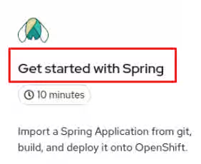
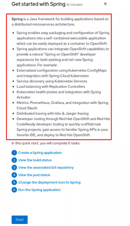
You can create quick start tutorials for OpenShift Container Platform that provide guided steps within the web console with user tasks. They are helpful for getting oriented with an application, Operator, or other product offering.
1.1. Administrator role in the web console
The cluster administrator role enables you to view the cluster inventory, capacity, general and specific utilization information, and the stream of important events, all of which help you to simplify planning and troubleshooting tasks. Both project administrators and cluster administrators can use all features in the web console.
Cluster administrators can also open an embedded command-line terminal instance with the web terminal Operator in OpenShift Container Platform 4.7 and later.
The Administrator perspective provides workflows specific to administrator use cases, such as the ability to:
Manage workload, storage, networking, and cluster settings.
Install and manage Operators using the software catalog.
Add identity providers that allow users to log in and manage user access through roles and role bindings.
View and manage a variety of advanced settings such as cluster updates, partial cluster updates, cluster Operators, custom resource definitions (CRDs), role bindings, and resource quotas.
Access and manage monitoring features such as metrics, alerts, and monitoring dashboards.
View and manage logging, metrics, and high-status information about the cluster.
Visually interact with applications, components, and services.
1.2. Developer role in the web console
The developer role in the web console offers several built-in ways to deploy applications, services, and databases. With the developer role, you can:
View real-time visualization of rolling and recreating rollouts on the component.
View the application status, resource utilization, project event streaming, and quota consumption.
Share your project with others.
Troubleshoot problems with your applications by running Prometheus Query Language (PromQL) queries on your project and examining the metrics visualized on a plot. The metrics provide information about the state of a cluster and any user-defined workloads that you are monitoring.
Cluster administrators can also open an embedded command-line terminal instance in the web console in OpenShift Container Platform 4.7 and later.
Developers have access to workflows specific to their use cases, such as the ability to:
Create and deploy applications on OpenShift Container Platform by importing existing codebases, images, and container files.
Visually interact with applications, components, and services associated with them within a project and monitor their deployment and build status.
Group components within an application and connect the components within and across applications.
Create workspaces to edit their application code using Eclipse Che.
You can use the Topology view to display applications, components, and workloads of your project. If you have no workloads in the project, the Topology view will show some links to create or import them. You can also use the Quick Search to import components directly.
1.3. Enabling the Developer perspective in the web console
Starting with OpenShift Container Platform 4.19, the perspectives in the web console have unified. There is no longer a Developer perspective by default; however, cluster administrators can enable the Developer perspective for developers to use.
You can enable the Developer perspective with the following steps:
Prerequisites
You have access to the web console as a user with cluster-admin privileges.
Procedure
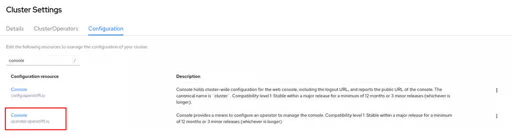
Navigate to the Cluster Settings page by clicking Administration → Cluster Settings.
Select the Configuration tab on the Cluster Settings page.
Type console in the search to locate the Console Operator resource and select operator.openshift.io.
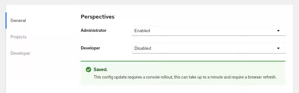
On the Cluster Details page, click the Actions menu and select Customize.
In the General tab, locate the Perspectives section. You can enable or disable the Developer perspective as needed. Changes are automatically applied.
Optional: You can enable the Developer perspective with the CLI by running the following command:
The OpenShift Container Platform web console is a user interface accessible from a web browser. You can use the web console to visualize, browse, and manage the contents of projects.
2.1. Prerequisites
You must use one of the following supported web browsers: Edge, Chrome, Safari, or Mozilla Firefox. IE 11 and earlier is not supported.
The web console runs as a pod on the control plane node. The static assets required to run the web console are served by the pod.
After you install OpenShift Container Platform using the openshift-install create cluster command, you can find the web console URL and login credentials for the installed cluster in the CLI output of the installation program. For example:
INFO Install complete!
INFO Run 'export KUBECONFIG=<your working directory>/auth/kubeconfig' to manage the cluster with 'oc', the OpenShift CLI.
INFO The cluster is ready when 'oc login -u kubeadmin -p <provided>' succeeds (wait a few minutes).
INFO Access the OpenShift web-console here: https://console-openshift-console.apps.demo1.openshift4-beta-abcorp.com
INFO Login to the console with user: kubeadmin, password: <provided>
Use those details to log in and access the web console.
For existing clusters that you did not install, you can use oc whoami --show-console to see the web console URL.
Important
The dir parameter specifies the assets directory, which stores the manifest files, the ISO image, and the auth directory. The auth directory stores the kubeadmin-password and kubeconfig files. As a kubeadmin user, you can use the kubeconfig file to access the cluster with the following setting: export KUBECONFIG=<install_directory>/auth/kubeconfig. The kubeconfig is specific to the generated ISO image, so if the kubeconfig is set and the oc command fails, it is possible that the system did not boot with the generated ISO image. To perform debugging, during the bootstrap process, you can log in to the console as the core user by using the contents of the kubeadmin-password file.
Chapter 3. Using the OpenShift Container Platform dashboard to get cluster information
The OpenShift Container Platform web console captures high-level information about the cluster.
3.1. About the OpenShift Container Platform dashboards page
Access the OpenShift Container Platform dashboard, which captures high-level information about the cluster, by navigating to Home → Overview from the OpenShift Container Platform web console.
The OpenShift Container Platform dashboard provides various cluster information, captured in individual dashboard cards.
The OpenShift Container Platform dashboard consists of the following cards:
Details provides a brief overview of informational cluster details.
Statuses include ok, error, warning, in progress, and unknown. Resources can add custom status names.
Cluster ID
Provider
Version
Cluster Inventory details the number of resources and associated statuses. It is helpful when intervention is required to resolve problems, including information about:
Number of nodes.
Number of pods.
Persistent storage volume claims.
Bare-metal hosts in the cluster, listed according to their state (only available in metal3 environment).
Status helps administrators understand how cluster resources are consumed. Click on a resource to jump to a detailed page listing pods and nodes that consume the largest amount of the specified cluster resource (CPU, memory, or storage).
Cluster Utilization shows the capacity of various resources over a specified period of time, to help administrators understand the scale and frequency of high resource consumption, including information about:
CPU time.
Memory allocation.
Storage consumed.
Network resources consumed.
Pod count.
Activity lists messages related to recent activity in the cluster, such as pod creation or virtual machine migration to another host.
3.2. Recognizing resource and project limits and quotas
You can view a graphical representation of available resources in the Topology view of the web console Developer perspective.
If a resource has a message about resource limitations or quotas being reached, a yellow border appears around the resource name. Click the resource to open a side panel to see the message. If the Topology view has been zoomed out, a yellow dot indicates that a message is available.
If you are using List View from the View Shortcuts menu, resources appear as a list. The Alerts column indicates if a message is available.
Chapter 4. Adding user preferences
You can change the default preferences for your profile to meet your requirements. You can set your default project, topology view (graph or list), editing medium (form or YAML), language preferences, and resource type.
The changes made to the user preferences are automatically saved.
4.1. Setting user preferences
You can set the default user preferences for your cluster.
Procedure
Log in to the OpenShift Container Platform web console using your login credentials.
Use the masthead to access the user preferences under the user profile.
In the General section:
In the Theme field, you can set the theme that you want to work in. The console defaults to the selected theme each time you log in.
In the Project field, select a project you want to work in. The console defaults to the project every time you log in.
In the Topology field, you can set the topology view to default to the graph or list view. If not selected, the console defaults to the last view you used.
In the Create/Edit resource method field, you can set a preference for creating or editing a resource. If both the form and YAML options are available, the console defaults to your selection.
In the Language section, select Default browser language to use the default browser language settings. Otherwise, select the language that you want to use for the console.
In the Notifications section, you can toggle display notifications created by users for specific projects on the Overview page or notification drawer.
In the Applications section:
You can view the default Resource type. For example, if the OpenShift Serverless Operator is installed, the default resource type is Serverless Deployment. Otherwise, the default resource type is Deployment.
You can select another resource type to be the default resource type from the Resource Type field.
Chapter 5. Configuring the web console in OpenShift Container Platform
You can modify the OpenShift Container Platform web console to set a logout redirect URL or disable the quick start tutorials.
5.1. Prerequisites
Deploy an OpenShift Container Platform cluster.
5.2. Configuring the web console
You can configure the web console settings by editing the console.config.openshift.io resource.
Edit the console.config.openshift.io resource:
$ oc edit console.config.openshift.io cluster
The following example displays the sample resource definition for the console:
Specify the URL of the page to load when a user logs out of the web console. If you do not specify a value, the user returns to the login page for the web console. Specifying a logoutRedirect URL allows your users to perform single logout (SLO) through the identity provider to destroy their single sign-on session.
The web console URL. To update this to a custom value, see Customizing the web console URL.
5.3. Disabling quick starts in the web console
You can use the Administrator perspective of the web console to disable one or more quick starts.
Prerequisites
You have cluster administrator permissions and are logged in to the web console.
Procedure
In the Administrator perspective, navigate to Administation → Cluster Settings.
On the Cluster Settings page, click the Configuration tab.
On the Configuration page, click the Console configuration resource with the description operator.openshift.io.
From the Action drop-down list, select Customize, which opens the Cluster configuration page.
On the General tab, in the Quick starts section, you can select items in either the Enabled or Disabled list, and move them from one list to the other by using the arrow buttons.
To enable or disable a single quick start, click the quick start, then use the single arrow buttons to move the quick start to the appropriate list.
To enable or disable multiple quick starts at once, press Ctrl and click the quick starts you want to move. Then, use the single arrow buttons to move the quick starts to the appropriate list.
To enable or disable all quick starts at once, click the double arrow buttons to move all of the quick starts to the appropriate list.
Chapter 6. Customizing the web console in OpenShift Container Platform
You can customize the OpenShift Container Platform web console to set a custom logo, product name, links, notifications, and command-line downloads. This is especially helpful if you need to tailor the web console to meet specific corporate or government requirements.
6.1. Adding a custom logo and product name
You can create custom branding by adding a custom logo or custom product name. You can set both or one without the other, as these settings are independent of each other.
Prerequisites
You must have administrator privileges.
Create a file of the logo that you want to use. The logo can be a file in any common image format, including GIF, JPG, PNG, or SVG, and is constrained to a max-height of 60px. Image size must not exceed 1 MB due to constraints on the ConfigMap object size.
Procedure
Import your logo file into a config map in the openshift-config namespace:
Once the Operator configuration is updated, it will sync the custom logo config map into the console namespace, mount it to the console pod, and redeploy.
Check for success. If there are any issues, the console cluster Operator will report a Degraded status, and the console Operator configuration will also report a CustomLogoDegraded status, but with reasons such as KeyOrFilenameInvalid or NoImageProvided.
To check the clusteroperator, run:
$ oc get clusteroperator console -o yaml
To check the console Operator configuration, run:
$ oc get consoles.operator.openshift.io -o yaml
6.2. Creating custom links in the web console
Prerequisites
You must have administrator privileges.
Procedure
From Administration → Custom Resource Definitions, click on ConsoleLink.
Select Instances tab
Click Create Console Link and edit the file:
apiVersion: console.openshift.io/v1
kind: ConsoleLink
metadata:
  name: example
spec:
  href: 'https://www.example.com'
  location: HelpMenu 1
  text: Link 1
Valid location settings are HelpMenu, UserMenu, ApplicationMenu, and NamespaceDashboard.
To make the custom link appear in all namespaces, follow this example:
apiVersion: console.openshift.io/v1
kind: ConsoleLink
metadata:
  name: namespaced-dashboard-link-for-all-namespaces
spec:
  href: 'https://www.example.com'
  location: NamespaceDashboard
  text: This appears in all namespaces
To make the custom link appear in only some namespaces, follow this example:
apiVersion: console.openshift.io/v1
kind: ConsoleLink
metadata:
  name: namespaced-dashboard-for-some-namespaces
spec:
  href: 'https://www.example.com'
  location: NamespaceDashboard
  # This text will appear in a box called "Launcher" under "namespace" or "project" in the web console
  text: Custom Link Text
  namespaceDashboard:
    namespaces:
    # for these specific namespaces
    - my-namespace
    - your-namespace
    - other-namespace
To make the custom link appear in the application menu, follow this example:
apiVersion: console.openshift.io/v1
kind: ConsoleLink
metadata:
  name: application-menu-link-1
spec:
  href: 'https://www.example.com'
  location: ApplicationMenu
  text: Link 1
  applicationMenu:
    section: My New Section
    # image that is 24x24 in size
    imageURL: https://via.placeholder.com/24
Click Save to apply your changes.
6.3. Customizing console routes
For console and downloads routes, custom routes functionality uses the ingress config route configuration API. If the console custom route is set up in both the ingress config and console-operator config, then the new ingress config custom route configuration takes precedent. The route configuration with the console-operator config is deprecated.
6.3.1. Customizing the console route
You can customize the console route by setting the custom hostname and TLS certificate in the spec.componentRoutes field of the cluster Ingress configuration.
Prerequisites
You have logged in to the cluster as a user with administrative privileges.
You have created a secret in the openshift-config namespace containing the TLS certificate and key. This is required if the domain for the custom hostname suffix does not match the cluster domain suffix. The secret is optional if the suffix matches.
Tip
You can create a TLS secret by using the oc create secret tls command.
Procedure
Edit the cluster Ingress configuration:
$ oc edit ingress.config.openshift.io cluster
Set the custom hostname and optionally the serving certificate and key:
Reference to a secret in the openshift-config namespace that contains a TLS certificate (tls.crt) and key (tls.key). This is required if the domain for the custom hostname suffix does not match the cluster domain suffix. The secret is optional if the suffix matches.
Save the file to apply the changes.
Note
Add a DNS record for the custom console route that points to the application ingress load balancer.
6.3.2. Customizing the download route
You can customize the download route by setting the custom hostname and TLS certificate in the spec.componentRoutes field of the cluster Ingress configuration.
Prerequisites
You have logged in to the cluster as a user with administrative privileges.
You have created a secret in the openshift-config namespace containing the TLS certificate and key. This is required if the domain for the custom hostname suffix does not match the cluster domain suffix. The secret is optional if the suffix matches.
Tip
You can create a TLS secret by using the oc create secret tls command.
Procedure
Edit the cluster Ingress configuration:
$ oc edit ingress.config.openshift.io cluster
Set the custom hostname and optionally the serving certificate and key:
Reference to a secret in the openshift-config namespace that contains a TLS certificate (tls.crt) and key (tls.key). This is required if the domain for the custom hostname suffix does not match the cluster domain suffix. The secret is optional if the suffix matches.
Save the file to apply the changes.
Note
Add a DNS record for the custom downloads route that points to the application ingress load balancer.
6.4. Customizing the login page
Create Terms of Service information with custom login pages. Custom login pages can also be helpful if you use a third-party login provider, such as GitHub or Google, to show users a branded page that they trust and expect before being redirected to the authentication provider. You can also render custom error pages during the authentication process.
Note
Customizing the error template is limited to identity providers (IDPs) that use redirects, such as request header and OIDC-based IDPs. It does not have an effect on IDPs that use direct password authentication, such as LDAP and htpasswd.
Prerequisites
You must have administrator privileges.
Procedure
Run the following commands to create templates you can modify:
Run oc explain oauths.spec.templates to understand the options.
6.5. Defining a template for an external log link
If you are connected to a service that helps you browse your logs, but you need to generate URLs in a particular way, then you can define a template for your link.
Prerequisites
You must have administrator privileges.
Procedure
From Administration → Custom Resource Definitions, click on ConsoleExternalLogLink.
Select Instances tab
Click Create Console External Log Link and edit the file:
apiVersion: console.openshift.io/v1
kind: ConsoleExternalLogLink
metadata:
  name: example
spec:
  hrefTemplate: >-
    https://example.com/logs?resourceName=${resourceName}&containerName=${containerName}&resourceNamespace=${resourceNamespace}&podLabels=${podLabels}
  text: Example Logs
6.6. Creating custom notification banners
Prerequisites
You must have administrator privileges.
Procedure
From Administration → Custom Resource Definitions, click on ConsoleNotification.
Select Instances tab
Click Create Console Notification and edit the file:
apiVersion: console.openshift.io/v1
kind: ConsoleNotification
metadata:
  name: example
spec:
  text: This is an example notification message with an optional link.
  location: BannerTop 1
  link:
    href: 'https://www.example.com'
    text: Optional link text
  color: '#fff'
  backgroundColor: '#0088ce'
Valid location settings are BannerTop, BannerBottom, and BannerTopBottom.
Click Create to apply your changes.
6.7. Customizing CLI downloads
You can configure links for downloading the CLI with custom link text and URLs, which can point directly to file packages or to an external page that provides the packages.
Prerequisites
You must have administrator privileges.
Procedure
Navigate to Administration → Custom Resource Definitions.
Select ConsoleCLIDownload from the list of Custom Resource Definitions (CRDs).
Click the YAML tab, and then make your edits:
apiVersion: console.openshift.io/v1
kind: ConsoleCLIDownload
metadata:
  name: example-cli-download-links
spec:
  description: |
    This is an example of download links
  displayName: example
  links:
  - href: 'https://www.example.com/public/example.tar'
    text: example for linux
  - href: 'https://www.example.com/public/example.mac.zip'
    text: example for mac
  - href: 'https://www.example.com/public/example.win.zip'
    text: example for windows
Click the Save button.
6.8. Adding YAML examples to Kubernetes resources
You can dynamically add YAML examples to any Kubernetes resources at any time.
Prerequisites
You must have cluster administrator privileges.
Procedure
From Administration → Custom Resource Definitions, click on ConsoleYAMLSample.
Click YAML and edit the file:
apiVersion: console.openshift.io/v1
kind: ConsoleYAMLSample
metadata:
  name: example
spec:
  targetResource:
    apiVersion: batch/v1
    kind: Job
  title: Example Job
  description: An example Job YAML sample
  yaml: |
    apiVersion: batch/v1
    kind: Job
    metadata:
      name: countdown
    spec:
      template:
        metadata:
          name: countdown
        spec:
          containers:
          - name: counter
            image: centos:7
            command:
            - "bin/bash"
            - "-c"
            - "for i in 9 8 7 6 5 4 3 2 1 ; do echo $i ; done"
          restartPolicy: Never
Use spec.snippet to indicate that the YAML sample is not the full YAML resource definition, but a fragment that can be inserted into the existing YAML document at the user’s cursor.
Click Save.
6.9. Customizing user perspectives
The OpenShift Container Platform web console provides two perspectives by default, Administrator and Developer. You might have more perspectives available depending on installed console plugins. As a cluster administrator, you can show or hide a perspective for all users or for a specific user role. Customizing perspectives ensures that users can view only the perspectives that are applicable to their role and tasks. For example, you can hide the Administrator perspective from unprivileged users so that they cannot manage cluster resources, users, and projects. Similarly, you can show the Developer perspective to users with the developer role so that they can create, deploy, and monitor applications.
You can also customize the perspective visibility for users based on role-based access control (RBAC). For example, if you customize a perspective for monitoring purposes, which requires specific permissions, you can define that the perspective is visible only to users with required permissions.
Each perspective includes the following mandatory parameters, which you can edit in the YAML view:
id: Defines the ID of the perspective to show or hide
visibility: Defines the state of the perspective along with access review checks, if needed
state: Defines whether the perspective is enabled, disabled, or needs an access review check
Note
By default, all perspectives are enabled. When you customize the user perspective, your changes are applicable to the entire cluster.
6.9.1. Customizing a perspective using YAML view
Prerequisites
You must have administrator privileges.
Procedure
In the Administrator perspective, navigate to Administration → Cluster Settings.
Select the Configuration tab and click the Console (operator.openshift.io) resource.
Click the YAML tab and make your customization:
To enable or disable a perspective, insert the snippet for Add user perspectives and edit the YAML code as needed:
In the Administrator perspective, navigate to Administration → Cluster Settings.
Select the Configuration tab and click the Console (operator.openshift.io) resource.
Click Actions → Customize on the right side of the page.
In the General settings, customize the perspective by selecting one of the following options from the dropdown list:
Enabled: Enables the perspective for all users
Only visible for privileged users: Enables the perspective for users who can list all namespaces
Only visible for unprivileged users: Enables the perspective for users who cannot list all namespaces
Disabled: Disables the perspective for all users
A notification opens to confirm that your changes are saved.
Note
When you customize the user perspective, your changes are automatically saved and take effect after a browser refresh.
6.10. Developer catalog and sub-catalog customization
As a cluster administrator, you have the ability to organize and manage the Developer catalog or its sub-catalogs. You can enable or disable the sub-catalog types or disable the entire developer catalog.
The developerCatalog.types object includes the following parameters that you must define in a snippet to use them in the YAML view:
state: Defines if a list of developer catalog types should be enabled or disabled.
enabled: Defines a list of developer catalog types (sub-catalogs) that are visible to users.
disabled: Defines a list of developer catalog types (sub-catalogs) that are not visible to users.
You can enable or disable the following developer catalog types (sub-catalogs) using the YAML view or the form view.
Builder Images
Templates
Devfiles
Samples
Helm Charts
Event Sources
Event Sinks
Operator Backed
6.10.1. Customizing a developer catalog or its sub-catalogs using the YAML view
You can customize a developer catalog by editing the YAML content in the YAML view.
Prerequisites
An OpenShift web console session with cluster administrator privileges.
Procedure
In the Administrator perspective of the web console, navigate to Administration → Cluster Settings.
Select the Configuration tab, click the Console (operator.openshift.io) resource and view the Details page.
Click the YAML tab to open the editor and edit the YAML content as needed.
For example, to disable a developer catalog type, insert the following snippet that defines a list of disabled developer catalog resources:
Dynamic plugins are loaded and interpreted from remote sources at runtime. One way to deliver and expose dynamic plugins to the console is through OLM Operators. The Operator creates a deployment on the platform with an HTTP server to host the plugin and exposes it using a Kubernetes service.
Dynamic plugins allow you to add custom pages and other extensions to your console user interface at runtime. The ConsolePlugin custom resource registers plugins with the console, and a cluster administrator enables plugins in the console Operator configuration.
7.1.1. Key features
A dynamic plugin allows you to make the following customizations to the OpenShift Container Platform experience:
Add custom pages.
Add perspectives beyond administrator and developer.
Add navigation items.
Add tabs and actions to resource pages.
7.1.2. General guidelines
When creating your plugin, follow these general guidelines:
Avoid selectors that could affect markup outside of your plugins components, such as element selectors. These are not APIs and are subject to change. Using them might break your plugin. Avoid selectors like element selectors that could affect markup outside of your plugins components.
Provide valid JavaScript Multipurpose Internet Mail Extension (MIME) type using the Content-Type response header for all assets served by your plugin web server. Each plugin deployment should include a web server that hosts the generated assets of the given plugin.
You must build your plugin with Webpack using Webpack version 5 and later.
You should prefix CSS class names with your plugin name to avoid collisions. For example, my-plugin__heading and my-plugin_\_icon.
You should maintain a consistent look, feel, and behavior with other console pages.
You should avoid selectors that could affect markup outside of your plugin components, such as element selectors. These are not APIs and are subject to change.
You must provide a valid JavaScript Multipurpose Internet Mail Extension (MIME) type using the Content-Type response header for all assets served by your plugin web server. Each plugin deployment should include a web server that hosts the generated assets of the given plugin.
7.1.3. PatternFly guidelines
When creating your plugin, follow these guidelines for using PatternFly:
Use Content from www.patternfly.org is not included.PatternFly components and PatternFly CSS variables. Core PatternFly components are available through the SDK. Using PatternFly components and variables help your plugin look consistent in future console versions.
Use PatternFly 4.x if you are using OpenShift Container Platform versions 4.14 and earlier.
Use PatternFly 5.x if you are using OpenShift Container Platform versions 4.15 through 4.18.
Use PatternFly 6.x if you are using OpenShift Container Platform versions 4.19 and later.
Avoid using other CSS libraries such as Bootstrap or Tailwind. They might conflict with PatternFly and not match the rest of the console. Plugins should only include styles that are specific to their user interfaces to be evaluated on top of base PatternFly styles. Do not import styles directly from @patternfly/react-styles/*/.css or @patternfly/patternfly. Instead, use components and CSS variables provided by the console SDK.
The console application is responsible for loading base styles for all supported PatternFly versions.
Optional: To test your plugin locally, run the OpenShift Container Platform web console in a container. You can use either Docker or Podman 3.2.0 or later.
Procedure
Prefix the name with plugin__ to avoid any naming conflicts. The plugin template uses the plugin__console-plugin-template namespace by default, and you must update when you rename your plugin for example, plugin__my-plugin. You can use the useTranslation hook, for example:
Loads all the plugin’s localization resources from the i18n namespace after the dynamic plugin during loading.
Use the format %plugin__console-plugin-template~My Label% for labels in console-extensions.json. The console replaces the value with the message for the current language from the plugin__console-plugin-template namespace. For example:
To update the JSON files in the locales folder of the plugin template when adding or changing a message, run the following command:
$ yarn i18n
7.2. Getting started with dynamic plugins
To get started using the dynamic plugin, you must set up your environment to write a new OpenShift Container Platform dynamic plugin. For an example of how to write a new plugin, see Adding a tab to the pods page.
7.2.1. Dynamic plugin development
You can run the plugin using a local development environment. The OpenShift Container Platform web console runs in a container connected to the cluster you have logged into.
In one terminal window, run the following command to install the dependencies for your plugin using yarn.
$ yarn install
After installing, run the following command to start yarn.
$ yarn run start
In another terminal window, login to the OpenShift Container Platform web console through the CLI.
$ oc login
Run the OpenShift Container Platform web console in a container connected to the cluster you have logged in to by running the following command:
$ yarn run start-console
Note
The yarn run start-console command runs an amd64 image and might fail when run with Apple Silicon and Podman. You can work around it with qemu-user-static by running the following commands:
To deploy your plugin to a cluster, install a Helm chart with the name of the plugin as the Helm release name into a new namespace or an existing namespace as specified by the -n command-line option. Provide the location of the image within the plugin.image parameter by using the following command:
Specifies an existing namespace to deploy your plugin into.
--create-namespace
Optional: If deploying to a new namespace, use this parameter.
--set plugin.image=my-plugin-image-location
Specifies the location of the image within the plugin.image parameter.
Note
If you are deploying on OpenShift Container Platform 4.10 and later, it is recommended to exclude configurations related to pod security by adding the parameter --set plugin.securityContext.enabled=false.
Optional: You can specify any additional parameters by using the set of supported parameters in the charts/openshift-console-plugin/values.yaml file.
View the list of enabled plugins by navigating from Administration → Cluster Settings → Configuration → Consoleoperator.openshift.io → Console plugins or by visiting the Overview page.
Note
It can take a few minutes for the new plugin configuration to appear. If you do not see your plugin, you might need to refresh your browser if the plugin was recently enabled. If you receive any errors at runtime, check the JS console in browser developer tools to look for any errors in your plugin code.
7.3.3. Plugin service proxy
If you need to make HTTP requests to an in-cluster service from your plugin, you can declare a service proxy in its ConsolePlugin resource by using the spec.proxy array field. The console backend exposes the /api/proxy/plugin/<plugin-name>/<proxy-alias>/<request-path>?<optional-query-parameters> endpoint to proxy the communication between the plugin and the service. A proxied request uses a service CA bundle by default. The service must use HTTPS.
Note
The plugin must use the consolefetch API to make requests from its JavaScript code or some requests might fail. For more information, see "Dynamic plugin API".
For each entry, you must specify an endpoint and alias of the proxy under the endpoint and alias fields. For the Service proxy type, you must set the endpoint type field to Service and the service must include values for the name, namespace, and port fields. For example, /api/proxy/plugin/helm/helm-charts/releases?limit=10 is a proxy request path from the helm plugin with a helm-charts service that lists ten helm releases.
If the service proxy request must contain the logged-in user’s OpenShift Container Platform access token, you must set the authorization field to UserToken.
Note
If the service proxy request does not contain the logged-in user’s OpenShift Container Platform access token, set the authorization field to None.
You can specify Content Security Policy (CSP) directives for your dynamic plugin using the contentSecurityPolicy field in the ConsolePluginSpec file. This field helps mitigate potential security risks by specifying which sources are allowed for fetching content like scripts, styles, images, and fonts. For dynamic plugins that require loading resources from external sources, defining custom CSP rules ensures secure integration into the OpenShift Container Platform console.
Important
The console currently uses the Content-Security-Policy-Report-Only response header, so the browser will only warn about CSP violations in the web console and enforcement of CSP policies will be limited. CSP violations will be logged in the browser console, but the associated CSP directives will not be enforced. This feature is behind a feature-gate, so you will need to manually enable it.
7.4.1. Key features of Content Security Policy (CSP)
A Content Security Policy (CSP) is delivered to the browser in the Content-Security-Policy-Report-Only response header. The policy is specified as a series of directives and values. Each directive type serves a different purpose, and each directive can have a list of values representing allowed sources.
7.4.1.1. Directive Types
The supported directive types include DefaultSrc, ScriptSrc, StyleSrc, ImgSrc, and FontSrc. These directives allow you to specify valid sources for loading different types of content for your plugin. Each directive type serves a different purpose. For example, ScriptSrc defines valid JavaScript sources, while ImgSrc controls where images can be loaded from.
7.4.1.2. Values
Each directive can have a list of values representing allowed sources. For example, ScriptSrc can specify multiple external scripts. These values are restricted to 1024 characters and cannot include whitespace, commas, or semicolons. Additionally, single-quoted strings and wildcard characters (*) are disallowed.
7.4.1.3. Unified Policy
The OpenShift Container Platform web console aggregates the CSP directives across all enabled ConsolePlugin custom resources (CRs) and merges them with its own default policy. The combined policy is then applied with the Content-Security-Policy-Report-Only HTTP response header.
7.4.1.4. Validation Rules
Each directive can have up to 16 unique values.
The total size of all values across directives must not exceed 8192 bytes (8KB).
Each value must be unique, and additional validation rules are in place to ensure no quotes, spaces, commas, or wildcard symbols are used.
Before working through the example, verify that the plugin is working by following the steps in Dynamic plugin development
7.5.1. Adding a tab to the pods page
There are different customizations you can make to the OpenShift Container Platform web console. The following procedure adds a tab to the Pod details page as an example extension to your plugin.
Note
The OpenShift Container Platform web console runs in a container connected to the cluster you have logged into. See "Dynamic plugin development" for information to test the plugin before creating your own.
Write a message to display on a new custom tab on the Pods page by creating a new file src/components/ExampleTab.tsx and adding the following script:
import * as React from 'react';

export default function ExampleTab() {
    return (
        <p>This is a custom tab added to a resource using a dynamic plugin.</p>
    );
}
Install a Helm chart with the name of the plugin as the Helm release name into a new namespace or an existing namespace as specified by the -n command-line option to deploy your plugin on a cluster. Provide the location of the image within the plugin.image parameter by using the following command:
For more information on deploying your plugin on a cluster, see "Deploy your plugin on a cluster".
Verification
Visit a Pod page to view the added tab.
7.6. Dynamic plugin reference
You can add extensions that allow you to customize your plugin. Those extensions are then loaded to the console at run-time.
7.6.1. Dynamic plugin extension types
7.6.1.1. console.action/filter
ActionFilter can be used to filter an action.
Name
Value Type
Optional
Description
contextId
string
no
The context ID helps to narrow the scope of contributed actions to a particular area of the application. Examples include topology and helm.
filter
CodeRef<(scope: any, action: Action) ⇒ boolean>
no
A function that will filter actions based on some conditions.
scope: The scope in which actions should be provided for. A hook might be required if you want to remove the ModifyCount action from a deployment with a horizontal pod autoscaler (HPA).
7.6.1.2. console.action/group
ActionGroup contributes an action group that can also be a submenu.
Name
Value Type
Optional
Description
id
string
no
ID used to identify the action section.
label
string
yes
The label to display in the UI. Required for submenus.
submenu
boolean
yes
Whether this group should be displayed as submenu.
insertBefore
string | string[]
yes
Insert this item before the item referenced here. For arrays, the first one found in order is used.
insertAfter
string | string[]
yes
Insert this item after the item referenced here. For arrays, the first one found in order is used. The insertBefore value takes precedence.
7.6.1.3. console.action/provider
ActionProvider contributes a hook that returns list of actions for specific context.
Name
Value Type
Optional
Description
contextId
string
no
The context ID helps to narrow the scope of contributed actions to a particular area of the application. Examples include topology and helm.
provider
CodeRef<ExtensionHook<Action[], any>>
no
A React hook that returns actions for the given scope. If contextId = resource, then the scope will always be a Kubernetes resource object.
7.6.1.4. console.action/resource-provider
ResourceActionProvider contributes a hook that returns list of actions for specific resource model.
Name
Value Type
Optional
Description
model
ExtensionK8sKindVersionModel
no
The model for which this provider provides actions for.
provider
CodeRef<ExtensionHook<Action[], any>>
no
A react hook which returns actions for the given resource model
7.6.1.5. console.alert-action
This extension can be used to trigger a specific action when a specific Prometheus alert is observed by the Console based on its rule.name value.
Name
Value Type
Optional
Description
alert
string
no
Alert name as defined by alert.rule.name property
text
string
no
action
CodeRef<(alert: any) ⇒ void>
no
Function to perform side effect
7.6.1.6. console.catalog/item-filter
This extension can be used for plugins to contribute a handler that can filter specific catalog items. For example, the plugin can contribute a filter that filters helm charts from specific provider.
Name
Value Type
Optional
Description
catalogId
string | string[]
no
The unique identifier for the catalog this provider contributes to.
type
string
no
Type ID for the catalog item type.
filter
CodeRef<(item: CatalogItem) ⇒ boolean>
no
Filters items of a specific type. Value is a function that takes CatalogItem[] and returns a subset based on the filter criteria.
7.6.1.7. console.catalog/item-metadata
This extension can be used to contribute a provider that adds extra metadata to specific catalog items.
Name
Value Type
Optional
Description
catalogId
string | string[]
no
The unique identifier for the catalog this provider contributes to.
A hook which returns a function that will be used to provide metadata to catalog items of a specific type.
7.6.1.8. console.catalog/item-provider
This extension allows plugins to contribute a provider for a catalog item type. For example, a Helm Plugin can add a provider that fetches all the Helm Charts. This extension can also be used by other plugins to add more items to a specific catalog item type.
Name
Value Type
Optional
Description
catalogId
string | string[]
no
The unique identifier for the catalog this provider contributes to.
Fetch items and normalize it for the catalog. Value is a react effect hook.
priority
number
yes
Priority for this provider. Defaults to 0. Higher priority providers may override catalog items provided by other providers.
7.6.1.9. console.catalog/item-type
This extension allows plugins to contribute a new type of catalog item. For example, a Helm plugin can define a new catalog item type as HelmCharts that it wants to contribute to the Developer Catalog.
Name
Value Type
Optional
Description
type
string
no
Type for the catalog item.
title
string
no
Title for the catalog item.
catalogDescription
string | CodeRef<React.ReactNode>
yes
Description for the type specific catalog.
typeDescription
string
yes
Description for the catalog item type.
filters
CatalogItemAttribute[]
yes
Custom filters specific to the catalog item.
groupings
CatalogItemAttribute[]
yes
Custom groupings specific to the catalog item.
7.6.1.10. console.catalog/item-type-metadata
This extension allows plugins to contribute extra metadata like custom filters or groupings for any catalog item type. For example, a plugin can attach a custom filter for HelmCharts that can filter based on chart provider.
Name
Value Type
Optional
Description
type
string
no
Type for the catalog item.
filters
CatalogItemAttribute[]
yes
Custom filters specific to the catalog item.
groupings
CatalogItemAttribute[]
yes
Custom groupings specific to the catalog item.
7.6.1.11. console.cluster-overview/inventory-item
Adds a new inventory item into cluster overview page.
Adds a resource tile to the project overview inventory card.
Name
Value Type
Optional
Description
model
CodeRef<T>
no
The model for resource which will be fetched. Used to get the model’s label or abbr.
mapper
CodeRef<StatusGroupMapper<T, R>>
yes
Function which maps various statuses to groups.
additionalResources
CodeRef<WatchK8sResources<R>>
yes
Additional resources which will be fetched and passed to the mapper function.
7.6.1.28. console.dashboards/tab
Adds a new dashboard tab, placed after the Overview tab.
Name
Value Type
Optional
Description
id
string
no
A unique tab identifier, used as tab link href and when adding cards to this tab.
navSection
'home' | 'storage'
no
Navigation section to which the tab belongs to.
title
string
no
The title of the tab.
7.6.1.29. console.file-upload
This extension can be used to provide a handler for the file drop action on specific file extensions.
Name
Value Type
Optional
Description
fileExtensions
string[]
no
Supported file extensions.
handler
CodeRef<FileUploadHandler>
no
Function which handles the file drop action.
7.6.1.30. console.flag
Gives full control over the web console feature flags.
Name
Value Type
Optional
Description
handler
CodeRef<FeatureFlagHandler>
no
Used to set or unset arbitrary feature flags.
7.6.1.31. console.flag/hookProvider
Gives full control over the web console feature flags with hook handlers.
Name
Value Type
Optional
Description
handler
CodeRef<FeatureFlagHandler>
no
Used to set or unset arbitrary feature flags.
7.6.1.32. console.flag/model
Adds a new web console feature flag driven by the presence of a CustomResourceDefinition (CRD) object on the cluster.
Name
Value Type
Optional
Description
flag
string
no
The name of the flag to set after the CRD is detected.
model
ExtensionK8sModel
no
The model which refers to a CRD.
7.6.1.33. console.global-config
This extension identifies a resource used to manage the configuration of the cluster. A link to the resource will be added to the Administration → Cluster Settings → Configuration page.
Name
Value Type
Optional
Description
id
string
no
Unique identifier for the cluster config resource instance.
name
string
no
The name of the cluster config resource instance.
model
ExtensionK8sModel
no
The model which refers to a cluster config resource.
namespace
string
no
The namespace of the cluster config resource instance.
7.6.1.34. console.model-metadata
Customize the display of models by overriding values retrieved and generated through API discovery.
Name
Value Type
Optional
Description
model
ExtensionK8sGroupModel
no
The model to customize. May specify only a group, or optional version and kind.
badge
ModelBadge
yes
Whether to consider this model reference as Technology Preview or Developer Preview.
color
string
yes
The color to associate to this model.
label
string
yes
Override the label. Requires kind be provided.
labelPlural
string
yes
Override the plural label. Requires kind be provided.
abbr
string
yes
Customize the abbreviation. Defaults to all uppercase characters in kind, up to 4 characters long. Requires that kind is provided.
7.6.1.35. console.navigation/href
This extension can be used to contribute a navigation item that points to a specific link in the UI.
Name
Value Type
Optional
Description
id
string
no
A unique identifier for this item.
name
string
no
The name of this item.
href
string
no
The link href value.
perspective
string
yes
The perspective ID to which this item belongs to. If not specified, contributes to the default perspective.
section
string
yes
Navigation section to which this item belongs to. If not specified, render this item as a top level link.
dataAttributes
{ [key: string]: string; }
yes
Adds data attributes to the DOM.
startsWith
string[]
yes
Mark this item as active when the URL starts with one of these paths.
insertBefore
string | string[]
yes
Insert this item before the item referenced here. For arrays, the first one found in order is used.
insertAfter
string | string[]
yes
Insert this item after the item referenced here. For arrays, the first one found in order is used. insertBefore takes precedence.
namespaced
boolean
yes
If true, adds /ns/active-namespace to the end.
prefixNamespaced
boolean
yes
If true, adds /k8s/ns/active-namespace to the beginning.
7.6.1.36. console.navigation/resource-cluster
This extension can be used to contribute a navigation item that points to a cluster resource details page. The K8s model of that resource can be used to define the navigation item.
Name
Value Type
Optional
Description
id
string
no
A unique identifier for this item.
model
ExtensionK8sModel
no
The model for which this navigation item links to.
perspective
string
yes
The perspective ID to which this item belongs to. If not specified, contributes to the default perspective.
section
string
yes
Navigation section to which this item belongs to. If not specified, render this item as a top-level link.
dataAttributes
{ [key: string]: string; }
yes
Adds data attributes to the DOM.
startsWith
string[]
yes
Mark this item as active when the URL starts with one of these paths.
insertBefore
string | string[]
yes
Insert this item before the item referenced here. For arrays, the first one found in order is used.
insertAfter
string | string[]
yes
Insert this item after the item referenced here. For arrays, the first one found in order is used. insertBefore takes precedence.
name
string
yes
Overrides the default name. If not supplied the name of the link will equal the plural value of the model.
7.6.1.37. console.navigation/resource-ns
This extension can be used to contribute a navigation item that points to a namespaced resource details page. The K8s model of that resource can be used to define the navigation item.
Name
Value Type
Optional
Description
id
string
no
A unique identifier for this item.
model
ExtensionK8sModel
no
The model for which this navigation item links to.
perspective
string
yes
The perspective ID to which this item belongs to. If not specified, contributes to the default perspective.
section
string
yes
Navigation section to which this item belongs to. If not specified, render this item as a top-level link.
dataAttributes
{ [key: string]: string; }
yes
Adds data attributes to the DOM.
startsWith
string[]
yes
Mark this item as active when the URL starts with one of these paths.
insertBefore
string | string[]
yes
Insert this item before the item referenced here. For arrays, the first one found in order is used.
insertAfter
string | string[]
yes
Insert this item after the item referenced here. For arrays, the first one found in order is used. insertBefore takes precedence.
name
string
yes
Overrides the default name. If not supplied the name of the link will equal the plural value of the model.
7.6.1.38. console.navigation/section
This extension can be used to define a new section of navigation items in the navigation tab.
Name
Value Type
Optional
Description
id
string
no
A unique identifier for this item.
perspective
string
yes
The perspective ID to which this item belongs to. If not specified, contributes to the default perspective.
dataAttributes
{ [key: string]: string; }
yes
Adds data attributes to the DOM.
insertBefore
string | string[]
yes
Insert this item before the item referenced here. For arrays, the first one found in order is used.
insertAfter
string | string[]
yes
Insert this item after the item referenced here. For arrays, the first one found in order is used. insertBefore takes precedence.
name
string
yes
Name of this section. If not supplied, only a separator will be shown above the section.
7.6.1.39. console.navigation/separator
This extension can be used to add a separator between navigation items in the navigation.
Name
Value Type
Optional
Description
id
string
no
A unique identifier for this item.
perspective
string
yes
The perspective ID to which this item belongs to. If not specified, contributes to the default perspective.
section
string
yes
Navigation section to which this item belongs to. If not specified, render this item as a top level link.
dataAttributes
{ [key: string]: string; }
yes
Adds data attributes to the DOM.
insertBefore
string | string[]
yes
Insert this item before the item referenced here. For arrays, the first one found in order is used.
insertAfter
string | string[]
yes
Insert this item after the item referenced here. For arrays, the first one found in order is used. insertBefore takes precedence.
Predicate that tells whether to render the status component or not.
7.6.1.51. console.redux-reducer
Adds new reducer to Console Redux store which operates on plugins.<scope> substate.
Name
Value Type
Optional
Description
scope
string
no
The key to represent the reducer-managed substate within the Redux state object.
reducer
CodeRef<Reducer<any, AnyAction>>
no
The reducer function, operating on the reducer-managed substate.
7.6.1.52. console.resource/create
This extension allows plugins to provide a custom component (i.e., wizard or form) for specific resources, which will be rendered, when users try to create a new resource instance.
Name
Value Type
Optional
Description
model
ExtensionK8sModel
no
The model for which this create resource page will be rendered
An optional React component that will render the details item value.
sortWeight
number
yes
An optional sort weight, relative to all other details items in the same column. Represented by any valid Content from developer.mozilla.org is not included.JavaScriptNumber. Items in each column are sorted independently, lowest to highest. Items without sort weightsare sorted after items with sort weights.
7.6.1.54. console.storage-class/provisioner
Adds a new storage class provisioner as an option during storage class creation.
Name
Value Type
Optional
Description
CSI
ProvisionerDetails
yes
Container Storage Interface provisioner type
OTHERS
ProvisionerDetails
yes
Other provisioner type
7.6.1.55. console.storage-provider
This extension can be used to contribute a new storage provider to select, when attaching storage and a provider specific component.
The component to be rendered when the route matches.
7.6.1.58. console.telemetry/listener
This component can be used to register a listener function receiving telemetry events. These events include user identification, page navigation, and other application specific events. The listener may use this data for reporting and analytics purposes.
Name
Value Type
Optional
Description
listener
CodeRef<TelemetryEventListener>
no
Listen for telemetry events
7.6.1.59. console.topology/adapter/build
BuildAdapter contributes an adapter to adapt element to data that can be used by the Build component.
Use to determine if a connection can be created between the source and target node
tooltip
string
no
Tooltip to show when connector operation is hovering over the drop target, for example, "Create a Visual Connector"
create
CodeRef<RelationshipProviderCreate>
no
Callback to execute when connector is drop over target node to create a connection
priority
number
no
Priority for relationship, higher will be preferred in case of multiple
7.6.1.72. console.user-preference/group
This extension can be used to add a group on the console user-preferences page. It will appear as a vertical tab option on the console user-preferences page.
Name
Value Type
Optional
Description
id
string
no
ID used to identify the user preference group.
label
string
no
The label of the user preference group
insertBefore
string
yes
ID of user preference group before which this group should be placed
insertAfter
string
yes
ID of user preference group after which this group should be placed
7.6.1.73. console.user-preference/item
This extension can be used to add an item to the user preferences group on the console user preferences page.
Name
Value Type
Optional
Description
id
string
no
ID used to identify the user preference item and referenced in insertAfter and insertBefore to define the item order
label
string
no
The label of the user preference
description
string
no
The description of the user preference
field
UserPreferenceField
no
The input field options used to render the values to set the user preference
groupId
string
yes
IDs used to identify the user preference groups the item would belong to
insertBefore
string
yes
ID of user preference item before which this item should be placed
insertAfter
string
yes
ID of user preference item after which this item should be placed
7.6.1.74. console.yaml-template
YAML templates for editing resources via the yaml editor.
Name
Value Type
Optional
Description
model
ExtensionK8sModel
no
Model associated with the template.
template
CodeRef<string>
no
The YAML template.
name
string
no
The name of the template. Use the name default to mark this as the default template.
7.6.1.75. dev-console.add/action
This extension allows plugins to contribute an add action item to the add page of developer perspective. For example, a Serverless plugin can add a new action item for adding serverless functions to the add page of developer console.
Name
Value Type
Optional
Description
id
string
no
ID used to identify the action.
label
string
no
The label of the action.
description
string
no
The description of the action.
href
string
no
The href to navigate to.
groupId
string
yes
IDs used to identify the action groups the action would belong to.
icon
CodeRef<React.ReactNode>
yes
The perspective display icon.
accessReview
AccessReviewResourceAttributes[]
yes
Optional access review to control the visibility or enablement of the action.
7.6.1.76. dev-console.add/action-group
This extension allows plugins to contibute a group in the add page of developer console. Groups can be referenced by actions, which will be grouped together in the add action page based on their extension definition. For example, a Serverless plugin can contribute a Serverless group and together with multiple add actions.
Name
Value Type
Optional
Description
id
string
no
ID used to identify the action group
name
string
no
The title of the action group
insertBefore
string
yes
ID of action group before which this group should be placed
insertAfter
string
yes
ID of action group after which this group should be placed
7.6.1.77. dev-console.import/environment
This extension can be used to specify extra build environment variable fields under the builder image selector in the developer console git import form. When set, the fields will override environment variables of the same name in the build section.
Name
Value Type
Optional
Description
imageStreamName
string
no
Name of the image stream to provide custom environment variables for
imageStreamTags
string[]
no
List of supported image stream tags
environments
ImageEnvironment[]
no
List of environment variables
7.6.1.78. console.dashboards/overview/detail/item
Deprecated: use CustomOverviewDetailItem type instead.
Name
Value Type
Optional
Description
component
CodeRef<React.ComponentType<{}>>
no
The value, based on the DetailItem component
7.6.1.79. console.page/resource/tab
Deprecated: Use console.tab/horizontalNav instead. Adds a new resource tab page to Console router.
The component to be rendered when the route matches.
name
string
no
The name of the tab.
href
string
yes
The optional href for the tab link. If not provided, the first path is used.
exact
boolean
yes
When true, will only match if the path matches the location.pathname exactly.
7.6.2. Dynamic plugin API
7.6.2.1. useActivePerspective
Hook that provides the currently active perspective and a callback for setting the active perspective. It returns a tuple containing the current active perspective and setter callback.
Component for displaying a green check mark circle icon.
Example
<GreenCheckCircleIcon title="Healthy" />
Parameter Name
Description
className
(optional) additional class name for the component
title
(optional) icon title
size
(optional) icon size: (sm, md, lg, xl)
7.6.2.3. RedExclamationCircleIcon
Component for displaying a red exclamation mark circle icon.
Example
<RedExclamationCircleIcon title="Failed" />
Parameter Name
Description
className
(optional) additional class name for the component
title
(optional) icon title
size
(optional) icon size: (sm, md, lg, xl)
7.6.2.4. YellowExclamationTriangleIcon
Component for displaying a yellow triangle exclamation icon.
Example
<YellowExclamationTriangleIcon title="Warning" />
Parameter Name
Description
className
(optional) additional class name for the component
title
(optional) icon title
size
(optional) icon size: (sm, md, lg, xl)
7.6.2.5. BlueInfoCircleIcon
Component for displaying a blue info circle icon.
Example
<BlueInfoCircleIcon title="Info" />
Parameter Name
Description
className
(optional) additional class name for the component
title
(optional) icon title
size
(optional) icon size: ('sm', 'md', 'lg', 'xl')
7.6.2.6. ErrorStatus
Component for displaying an error status popover.
Example
<ErrorStatus title={errorMsg} />
Parameter Name
Description
title
(optional) status text
iconOnly
(optional) if true, only displays icon
noTooltip
(optional) if true, tooltip is not displayed
className
(optional) additional class name for the component
popoverTitle
(optional) title for popover
7.6.2.7. InfoStatus
Component for displaying an information status popover.
Example
<InfoStatus title={infoMsg} />
Parameter Name
Description
title
(optional) status text
iconOnly
(optional) if true, only displays icon
noTooltip
(optional) if true, tooltip is not displayed
className
(optional) additional class name for the component
popoverTitle
(optional) title for popover
7.6.2.8. ProgressStatus
Component for displaying a progressing status popover.
Example
<ProgressStatus title={progressMsg} />
Parameter Name
Description
title
(optional) status text
iconOnly
(optional) if true, only displays icon
noTooltip
(optional) if true, tooltip is not displayed
className
(optional) additional class name for the component
popoverTitle
(optional) title for popover
7.6.2.9. SuccessStatus
Component for displaying a success status popover.
Example
<SuccessStatus title={successMsg} />
Parameter Name
Description
title
(optional) status text
iconOnly
(optional) if true, only displays icon
noTooltip
(optional) if true, tooltip is not displayed
className
(optional) additional class name for the component
popoverTitle
(optional) title for popover
7.6.2.10. checkAccess
Provides information about user access to a given resource. It returns an object with resource access information.
Parameter Name
Description
resourceAttributes
resource attributes for access review
impersonate
impersonation details
7.6.2.11. useAccessReview
Hook that provides information about user access to a given resource. It returns an array with isAllowed and loading values.
Parameter Name
Description
resourceAttributes
resource attributes for access review
impersonate
impersonation details
7.6.2.12. useResolvedExtensions
React hook for consuming Console extensions with resolved CodeRef properties. This hook accepts the same argument(s) as useExtensions hook and returns an adapted list of extension instances, resolving all code references within each extension’s properties.
Initially, the hook returns an empty array. After the resolution is complete, the React component is re-rendered with the hook returning an adapted list of extensions. When the list of matching extensions changes, the resolution is restarted. The hook continues to return the previous result until the resolution completes.
The hook’s result elements are guaranteed to be referentially stable across re-renders. It returns a tuple containing a list of adapted extension instances with resolved code references, a boolean flag indicating whether the resolution is complete, and a list of errors detected during the resolution.
Example
const [navItemExtensions, navItemsResolved] = useResolvedExtensions<NavItem>(isNavItem);
// process adapted extensions and render your component
Parameter Name
Description
typeGuards
A list of callbacks that each accept a dynamic plugin extension as an argument and return a boolean flag indicating whether or not the extension meets desired type constraints
7.6.2.13. HorizontalNav
A component that creates a Navigation bar for a page. Routing is handled as part of the component. console.tab/horizontalNav can be used to add additional content to any horizontal navigation.
A hook that provides a list of user-selected active TableColumns.
Example
// See implementation for more details on TableColumn type
  const [activeColumns, userSettingsLoaded] = useActiveColumns({
    columns,
    showNamespaceOverride: false,
    columnManagementID,
  });
  return userSettingsAreLoaded ? <VirtualizedTable columns={activeColumns} {...otherProps} /> : null
Parameter Name
Description
options
Which are passed as a key-value map
\{TableColumn[]} options.columns
An array of all available TableColumns
{boolean} [options.showNamespaceOverride]
(optional) If true, a namespace column is included, regardless of column management selections
{string} [options.columnManagementID]
(optional) A unique ID used to persist and retrieve column management selections to and from user settings. Usually a group/version/kind (GVK) string for a resource.
A tuple containing the current user selected active columns (a subset of options.columns), and a boolean flag indicating whether user settings have been loaded.
(optional) the kind of resource i.e. Pod, Deployment, Namespace
groupVersionKind
(optional) object with group, version, and kind
className
(optional) class style for component
displayName
(optional) display name for component, overwrites the resource name if set
inline
(optional) flag to create icon badge and name inline with children
linkTo
(optional) flag to create a Link object - defaults to true
name
(optional) name of resource
namesapce
(optional) specific namespace for the kind resource to link to
hideIcon
(optional) flag to hide the icon badge
title
(optional) title for the link object (not displayed)
dataTest
(optional) identifier for testing
onClick
(optional) callback function for when component is clicked
truncate
(optional) flag to truncate the link if too long
7.6.2.22. ResourceIcon
Component that creates an icon badge for a specific resource type.
Example
<ResourceIcon kind="Pod"/>
Parameter Name
Description
kind
(optional) the kind of resource i.e. Pod, Deployment, Namespace
groupVersionKind
(optional) object with group, version, and kind
className
(optional) class style for component
7.6.2.23. useK8sModel
Hook that retrieves the k8s model for provided K8sGroupVersionKind from redux. It returns an array with the first item as k8s model and second item as inFlight status.
group, version, kind of k8s resource K8sGroupVersionKind is preferred alternatively can pass reference for group, version, kind which is deprecated, i.e, group/version/kind (GVK) K8sResourceKindReference.
7.6.2.24. useK8sModels
Hook that retrieves all current k8s models from redux. It returns an array with the first item as the list of k8s model and second item as inFlight status.
Hook that retrieves the k8s resource along with status for loaded and error. It returns an array with first item as resource(s), second item as loaded status and third item as error state if any.
Hook that retrieves the k8s resources along with their respective status for loaded and error. It returns a map where keys are as provided in initResouces and value has three properties data, loaded and error.
Resources must be watched as key-value pair, wherein key is unique to resource and value is options needed to watch for the respective resource.
7.6.2.27. consoleFetch
A custom wrapper around fetch that adds console specific headers and allows for retries and timeouts.It also validates the response status code and throws appropriate error or logs out the user if required. It returns a promise that resolves to the response.
Parameter Name
Description
url
The URL to fetch
options
The options to pass to fetch
timeout
The timeout in milliseconds
7.6.2.28. consoleFetchJSON
A custom wrapper around fetch that adds console specific headers and allows for retries and timeouts. It also validates the response status code and throws appropriate error or logs out the user if required. It returns the response as a JSON object. Uses consoleFetch internally. It returns a promise that resolves to the response as JSON object.
Parameter Name
Description
url
The URL to fetch
method
The HTTP method to use. Defaults to GET
options
The options to pass to fetch
timeout
The timeout in milliseconds
cluster
The name of the cluster to make the request to. Defaults to the active cluster the user has selected
7.6.2.29. consoleFetchText
A custom wrapper around fetch that adds console specific headers and allows for retries and timeouts. It also validates the response status code and throws appropriate error or logs out the user if required. It returns the response as a text. Uses consoleFetch internally. It returns a promise that resolves to the response as text.
Parameter Name
Description
url
The URL to fetch
options
The options to pass to fetch
timeout
The timeout in milliseconds
cluster
The name of the cluster to make the request to. Defaults to the active cluster the user has selected
7.6.2.30. getConsoleRequestHeaders
A function that creates impersonation and multicluster related headers for API requests using current redux state. It returns an object containing the appropriate impersonation and clustr requst headers, based on redux state.
Parameter Name
Description
targetCluster
Override the current active cluster with the provided targetCluster
7.6.2.31. k8sGetResource
It fetches a resource from the cluster, based on the provided options. If the name is provided it returns one resource else it returns all the resources matching the model. It returns a promise that resolves to the response as JSON object with a resource if the name is providedelse it returns all the resources matching the model. In case of failure, the promise gets rejected with HTTP error response.
Parameter Name
Description
options
Which are passed as key-value pairs in the map
options.model
k8s model
options.name
The name of the resource, if not provided then it looks for all the resources matching the model.
options.ns
The namespace to look into, should not be specified for cluster-scoped resources.
options.path
Appends as subpath if provided
options.queryParams
The query parameters to be included in the URL.
options.requestInit
The fetch init object to use. This can have request headers, method, redirect, etc.
7.6.2.32. k8sCreateResource
It creates a resource in the cluster, based on the provided options. It returns a promise that resolves to the response of the resource created. In case of failure promise gets rejected with HTTP error response.
Parameter Name
Description
options
Which are passed as key-value pairs in the map
options.model
k8s model
options.data
Payload for the resource to be created
options.path
Appends as subpath if provided
options.queryParams
The query parameters to be included in the URL.
7.6.2.33. k8sUpdateResource
It updates the entire resource in the cluster, based on providedoptions. When a client needs to replace an existing resource entirely, they can use k8sUpdate. Alternatively can use k8sPatch to perform the partial update. It returns a promise that resolves to the response of the resource updated. In case of failure promise gets rejected with HTTP error response.
Parameter Name
Description
options
Which are passed as key-value pair in the map
options.model
k8s model
options.data
Payload for the k8s resource to be updated
options.ns
Namespace to look into, it should not be specified for cluster-scoped resources.
options.name
Resource name to be updated.
options.path
Appends as subpath if provided
options.queryParams
The query parameters to be included in the URL.
7.6.2.34. k8sPatchResource
It patches any resource in the cluster, based on provided options. When a client needs to perform the partial update, they can use k8sPatch. Alternatively can use k8sUpdate to replace an existing resource entirely. See Content from datatracker.ietf.org is not included.Data Tracker for more. It returns a promise that resolves to the response of the resource patched. In case of failure promise gets rejected with HTTP error response.
Parameter Name
Description
options
Which are passed as key-value pairs in the map.
options.model
k8s model
options.resource
The resource to be patched.
options.data
Only the data to be patched on existing resource with the operation, path, and value.
options.path
Appends as subpath if provided.
options.queryParams
The query parameters to be included in the URL.
7.6.2.35. k8sDeleteResource
It deletes resources from the cluster, based on the provided model, resource. The garbage collection works based on Foreground|Background can be configured with propagationPolicy property in provided model or passed in json. It returns a promise that resolves to the response of kind Status. In case of failure promise gets rejected with HTTP error response.
Same interface as k8sListResource but returns the sub items. It returns the apiVersion for the model, i.e., group/version.
7.6.2.38. getAPIVersionForModel
Provides apiVersion for a k8s model.
Parameter Name
Description
model
k8s model
7.6.2.39. getGroupVersionKindForResource
Provides a group, version, and kind for a resource. It returns the group, version, kind for the provided resource. If the resource does not have an API group, group "core" is returned. If the resource has an invalid apiVersion, then it throws an Error.
Parameter Name
Description
resource
k8s resource
7.6.2.40. getGroupVersionKindForModel
Provides a group, version, and kind for a k8s model. This returns the group, version, kind for the provided model. If the model does not have an apiGroup, group "core" is returned.
Parameter Name
Description
model
k8s model
7.6.2.41. StatusPopupSection
Component that shows the status in a popup window. Helpful component for building console.dashboards/overview/health/resource extensions.
Example
  <StatusPopupSection
    firstColumn={
      <>
        <span>{title}</span>
        <span className="text-secondary">
          My Example Item
        </span>
      </>
    }
    secondColumn='Status'
  >
Parameter Name
Description
firstColumn
values for first column of popup
secondColumn
(optional) values for second column of popup
children
(optional) children for the popup
7.6.2.42. StatusPopupItem
Status element used in status popup; used in StatusPopupSection.
A lazy loaded YAML editor for Kubernetes resources with hover help and completion. The component use the YAMLEditor and add on top of it more functionality like resource update handling, alerts, save, cancel and reload buttons, accessibility and more. Unless onSave callback is provided, the resource update is automatically handled. It should be wrapped in a React.Suspense component.
Sets up a poll to Prometheus for a single query. It returns a tuple containing the query response, a boolean flag indicating whether the response has completed, and any errors encountered during the request or post-processing of the request.
Parameter Name
Description
{PrometheusEndpoint} props.endpoint
one of the PrometheusEndpoint (label, query, range, rules, targets)
{string} [props.query]
(optional) Prometheus query string. If empty or undefined, polling is not started.
{number} [props.delay]
(optional) polling delay interval (ms)
{number} [props.endTime]
(optional) for QUERY_RANGE enpoint, end of the query range
{number} [props.samples]
(optional) for QUERY_RANGE enpoint
{number} [options.timespan]
(optional) for QUERY_RANGE enpoint
{string} [options.namespace]
(optional) a search param to append
{string} [options.timeout]
(optional) a search param to append
7.6.2.55. Timestamp
A component to render timestamp. The timestamps are synchronized between invidual instances of the Timestamp component. The provided timestamp is formatted according to user locale.
Parameter Name
Description
timestamp
the timestamp to render. Format is expected to be ISO 8601 (used by Kubernetes), epoch timestamp, or an instance of a Date.
simple
render simple version of the component omitting icon and tooltip.
omitSuffix
formats the date ommiting the suffix.
className
additional class name for the component.
7.6.2.56. useOverlay
The useOverlay hook inserts a component directly to the DOM outside the web console’s page structure. This allows the component to be freely styled and positioning with CSS. For example, to float the overlay in the top right corner of the UI: style={{ position: 'absolute', right: '2rem', top: '2rem', zIndex: 999 }}. It is possible to add multiple overlays by calling useOverlay multiple times. A closeOverlay function is passed to the overlay component. Calling it removes the component from the DOM without affecting any other overlays that might have been added with useOverlay. Additional props can be passed to useOverlay and they will be passed through to the overlay component.
A component that renders a horizontal toolbar with a namespace dropdown menu in the leftmost position. Additional components can be passed in as children and is rendered to the right of the namespace dropdown. This component is designed to be used at the top of the page. It should be used on pages where the user needs to be able to change the active namespace, such as on pages with k8s resources.
(optional) A function that is executed when a namespace option is selected. It accepts the new namespace in the form of a string as its only argument. The active namespace is updated automatically when an option is selected, but additional logic can be applied via this function. When the namespace is changed, the namespace parameter in the URL is changed from the previous namespace to the newly selected namespace.
isDisabled
(optional) A boolean flag that disables the namespace dropdown if set to true. This option only applies to the namespace dropdown and has no effect on child components.
children
(optional) Additional elements to be rendered inside the toolbar to the right of the namespace dropdown.
7.6.2.59. ErrorBoundaryFallbackPage
Creates full page ErrorBoundaryFallbackPage component to display the "Oh no! Something went wrong." message along with the stack trace and other helpful debugging information. This is to be used inconjunction with an component.
(optional) Base URL of an API endpoint that handles PromQL queries. If provided, this is used instead of the default API for fetching data.
defaultSamples
(optional) The default number of data samples plotted for each data series. If there are many data series, QueryBrowser might automatically pick a lower number of data samples than specified here.
defaultTimespan
(optional) The default timespan for the graph in milliseconds - defaults to 1,800,000 (30 minutes).
disabledSeries
(optional) Disable (do not display) data series with these exact label / value pairs.
disableZoom
(optional) Flag to disable the graph zoom controls.
filterLabels
(optional) Optionally filter the returned data series to only those that match these label / value pairs.
fixedEndTime
(optional) Set the end time for the displayed time range rather than showing data up to the current time.
formatSeriesTitle
(optional) Function that returns a string to use as the title for a single data series.
GraphLink
(optional) Component for rendering a link to another page (for example getting more information about this query).
hideControls
(optional) Flag to hide the graph controls for changing the graph timespan, and so on.
isStack
(optional) Flag to display a stacked graph instead of a line graph. If showStackedControl is set, it is still possible for the user to switch to a line graph.
namespace
(optional) If provided, data is only returned for this namespace (only series that have this namespace label).
onZoom
(optional) Callback called when the graph is zoomed.
pollInterval
(optional) If set, determines how often the graph is updated to show the latest data (in milliseconds).
queries
Array of PromQL queries to run and display the results in the graph.
showLegend
(optional) Flag to enable displaying a legend below the graph.
showStackedControl
Flag to enable displaying a graph control for switching between stacked graph mode and line graph mode.
timespan
(optional) The timespan that should be covered by the graph in milliseconds.
units
(optional) Units to display on the Y-axis and in the tooltip.
7.6.2.61. useAnnotationsModal
A hook that provides a callback to launch a modal for editing Kubernetes resource annotations.
Example
const PodAnnotationsButton = ({ pod }) => {
  const { t } = useTranslation();
  const launchAnnotationsModal = useAnnotationsModal<PodKind>(pod);
  return <button onClick={launchAnnotationsModal}>{t('Edit Pod Annotations')}</button>
}
Parameter Name
Description
resource
The resource to edit annotations for an object of K8sResourceCommon type.
Returns A function which launches a modal for editing a resource’s annotations.
7.6.2.62. useDeleteModal
A hook that provides a callback to launch a modal for deleting a resource.
Deprecated: Use the provided usePerspectiveContext instead. Creates the perspective context.
Parameter Name
Description
PerspectiveContextType
object with active perspective and setter
7.6.2.68. useAccessReviewAllowed
Deprecated: Use useAccessReview from @console/dynamic-plugin-sdk instead. Hook that provides allowed status about user access to a given resource. It returns the isAllowed boolean value.
Parameter Name
Description
resourceAttributes
resource attributes for access review
impersonate
impersonation details
7.6.2.69. useSafetyFirst
Deprecated: This hook is not related to console functionality. Hook that ensures a safe asynchronnous setting of React state in case a given component could be unmounted. It returns an array with a pair of state value and its set function.
  // See implementation for more details on RowFilter and FilterValue types
  const [staticData, filteredData, onFilterChange] = useListPageFilter(
    data,
    rowFilters,
    staticFilters,
  );
  // ListPageFilter updates filter state based on user interaction and resulting filtered data can be rendered in an independent component.
  return (
    <>
      <ListPageHeader .../>
      <ListPagBody>
        <ListPageFilter data={staticData} onFilterChange={onFilterChange} />
        <List data={filteredData} />
      </ListPageBody>
    </>
  )
Parameter Name
Description
data
An array of data points
loaded
indicates that data has loaded
onFilterChange
callback function for when filter is updated
rowFilters
(optional) An array of RowFilter elements that define the available filter options
nameFilterPlaceholder
(optional) placeholder for name filter
labelFilterPlaceholder
(optional) placeholder for label filter
hideLabelFilter
(optional) only shows the name filter instead of both name and label filter
hideNameLabelFilter
(optional) hides both name and label filter
columnLayout
(optional) column layout object
hideColumnManagement
(optional) flag to hide the column management
7.6.2.72. useListPageFilter
Deprecated: Use PatternFly’s Content from www.patternfly.org is not included.Data view instead. A hook that manages filter state for the ListPageFilter component. It returns a tuple containing the data filtered by all static filters, the data filtered by all static and row filters, and a callback that updates rowFilters.
Example
  // See implementation for more details on RowFilter and FilterValue types
  const [staticData, filteredData, onFilterChange] = useListPageFilter(
    data,
    rowFilters,
    staticFilters,
  );
  // ListPageFilter updates filter state based on user interaction and resulting filtered data can be rendered in an independent component.
  return (
    <>
      <ListPageHeader .../>
      <ListPagBody>
        <ListPageFilter data={staticData} onFilterChange={onFilterChange} />
        <List data={filteredData} />
      </ListPageBody>
    </>
  )
Parameter Name
Description
data
An array of data points
rowFilters
(optional) An array of RowFilter elements that define the available filter options
staticFilters
(optional) An array of FilterValue elements that are statically applied to the data
7.6.2.73. YAMLEditor
Deprecated: Use CodeEditor instead. A basic lazy loaded YAML editor with hover help and completion.
Refer to this list of troubleshooting tips if you run into issues loading your plugin.
Verify that you have enabled your plugin in the console Operator configuration and your plugin name is the output by running the following command:
$ oc get console.operator.openshift.io cluster -o jsonpath='{.spec.plugins}'
Verify the enabled plugins on the status card of the Overview page. You must refresh your browser if the plugin was recently enabled.
Verify your plugin service is healthy by:
Verifying your plugin pod status is running and your containers are ready.
Verifying the service label selector matches the pod and the target port is correct.
Curl the plugin-manifest.json from the service in a terminal on the console pod or another pod on the cluster.
Verify your ConsolePlugin resource name (consolePlugin.name) matches the plugin name used in package.json.
Verify your service name, namespace, port, and path are declared correctly in the ConsolePlugin resource.
Verify your plugin service uses HTTPS and service serving certificates.
Verify any certificates or connection errors in the console pod logs.
Verify the feature flag your plugin relies on is not disabled.
Verify your plugin does not have any consolePlugin.dependencies in package.json that are not met.
This can include console version dependencies or dependencies on other plugins. Filter the JS console in your browser for your plugin’s name to see messages that are logged.
Verify there are no typos in the nav extension perspective or section IDs.
Your plugin may be loaded, but nav items missing if IDs are incorrect. Try navigating to a plugin page directly by editing the URL.
Verify there are no network policies that are blocking traffic from the console pod to your plugin service.
If necessary, adjust network policies to allow console pods in the openshift-console namespace to make requests to your service.
Verify the list of dynamic plugins to be loaded in your browser in the Console tab of the developer tools browser.
Evaluate window.SERVER_FLAGS.consolePlugins to see the dynamic plugin on the Console frontend.
You can install the web terminal by using the Web Terminal Operator listed in the OpenShift Container Platform software catalog. When you install the Web Terminal Operator, the custom resource definitions (CRDs) that are required for the command line configuration, such as the DevWorkspace CRD, are automatically installed. The web console creates the required resources when you open the web terminal.
8.1.1. Prerequisites
You are logged into the OpenShift Container Platform web console.
You have cluster administrator permissions.
8.1.2. Procedure
In the Administrator perspective of the web console, navigate to Ecosystem → Software Catalog.
Use the Filter by keyword box to search for the Web Terminal Operator in the catalog, and then click the Web Terminal tile.
Read the brief description about the Operator on the Web Terminal page, and then click Install.
On the Install Operator page, retain the default values for all fields.
The fast option in the Update Channel menu enables installation of the latest release of the Web Terminal Operator.
The All namespaces on the cluster option in the Installation Mode menu enables the Operator to watch and be available to all namespaces in the cluster.
The openshift-operators option in the Installed Namespace menu installs the Operator in the default openshift-operators namespace.
The Automatic option in the Approval Strategy menu ensures that the future upgrades to the Operator are handled automatically by the Operator Lifecycle Manager.
Click Install.
In the Installed Operators page, click the View Operator to verify that the Operator is listed on the Installed Operators page.
Note
The Web Terminal Operator installs the DevWorkspace Operator as a dependency.
After the Operator is installed, refresh your page to see the command-line terminal icon (
) in the masthead of the console.
Note
If you install the Web Terminal Operator manually by creating a Subscription resource, you must name the Subscriptionweb-terminal. If you do not name it web-terminal, the terminal icon does not appear in the console masthead.
8.2. Configuring the web terminal
You can configure timeout and image settings for the web terminal, either for your current session or for all user sessions if you are a cluster administrator.
8.2.1. Configuring the web terminal timeout for a session
You can change the default timeout period for the web terminal for your current session.
Prerequisites
You have access to an OpenShift Container Platform cluster that has the Web Terminal Operator installed.
You are logged into the web console.
Procedure
Click the web terminal icon (
).
Optional: Set the web terminal timeout for the current session:
Click Timeout.
In the field that appears, enter the timeout value.
From the drop-down list, select a timeout interval of Seconds, Minutes, Hours, or Milliseconds.
Optional: Select a custom image for the web terminal to use.
Click Image.
In the field that appears, enter the URL of the image that you want to use.
Click Start to begin a terminal instance using the specified timeout setting.
8.2.2. Configuring the web terminal timeout for all users
You can use the Administrator perspective of the web console to set the default web terminal timeout period for all users.
Prerequisites
You have cluster administrator permissions and are logged in to the web console.
You have installed the Web Terminal Operator.
Procedure
In the Administrator perspective, navigate to Administation → Cluster Settings.
On the Cluster Settings page, click the Configuration tab.
On the Configuration page, click the Console configuration resource with the description operator.openshift.io.
From the Action drop-down list, select Customize, which opens the Cluster configuration page.
Click the Web Terminal tab, which opens the Web Terminal Configuration page.
Set a value for the timeout. From the drop-down list, select a time interval of Seconds, Minutes, Hours, or Milliseconds.
Click Save.
8.2.3. Configuring the web terminal image for a session
You can change the default image for the web terminal for your current session.
Prerequisites
You have access to an OpenShift Container Platform cluster that has the Web Terminal Operator installed.
You are logged into the web console.
Procedure
Click the web terminal icon (
).
Click Image to display advanced configuration options for the web terminal image.
Enter the URL of the image that you want to use.
Click Start to begin a terminal instance using the specified image setting.
8.2.4. Configuring the web terminal image for all users
You can use the Administrator perspective of the web console to set the default web terminal image for all users.
Prerequisites
You have cluster administrator permissions and are logged in to the web console.
You have installed the Web Terminal Operator.
Procedure
In the Administrator perspective, navigate to Administation → Cluster Settings.
On the Cluster Settings page, click the Configuration tab.
On the Configuration page, click the Console configuration resource with the description operator.openshift.io.
From the Action drop-down list, select Customize, which opens the Cluster configuration page.
Click the Web Terminal tab, which opens the Web Terminal Configuration page.
Enter the URL of the image that you want to use.
Click Save.
8.3. Using the web terminal
You can launch an embedded command-line terminal instance in the web console. This terminal instance is preinstalled with common CLI tools for interacting with the cluster, such as oc, kubectl,odo, kn, tkn, helm, and subctl. It also has the context of the project you are working on and automatically logs you in using your credentials.
8.3.1. Accessing the web terminal
After the Web Terminal Operator is installed, you can access the web terminal. After the web terminal is initialized, you can use the preinstalled CLI tools like oc, kubectl, odo, kn, tkn, helm, and subctl in the web terminal. You can re-run commands by selecting them from the list of commands you have run in the terminal. These commands persist across multiple terminal sessions. The web terminal remains open until you close it or until you close the browser window or tab.
Prerequisites
You have access to an OpenShift Container Platform cluster and are logged into the web console.
The Web Terminal Operator is installed on your cluster.
Procedure
To launch the web terminal, click the command-line terminal icon (
) in the masthead of the console. A web terminal instance is displayed in the Command line terminal pane. This instance is automatically logged in with your credentials.
If a project has not been selected in the current session, select the project where the DevWorkspace CR must be created from the Project drop-down list. By default, the current project is selected.
Note
One DevWorkspace CR defines the web terminal of one user. This CR contains details about the user’s web terminal status and container image components.
The DevWorkspace CR is created only if it does not already exist.
The openshift-terminal project is the default project used for cluster administrators. They do not have the option to choose another project. The Web Terminal Operator installs the DevWorkspace Operator as a dependency.
Optional: Set the web terminal timeout for the current session:
Click Timeout.
In the field that appears, enter the timeout value.
From the drop-down list, select a timeout interval of Seconds, Minutes, Hours, or Milliseconds.
Optional: Select a custom image for the web terminal to use.
Click Image.
In the field that appears, enter the URL of the image that you want to use.
Click Start to initialize the web terminal using the selected project.
Click + to open multiple tabs within the web terminal in the console.
8.4. Troubleshooting the web terminal
8.4.1. Web terminal and network policies
The web terminal might fail to start if the cluster has network policies configured. To start a web terminal instance, the Web Terminal Operator must communicate with the web terminal’s pod to verify it is running, and the OpenShift Container Platform web console needs to send information to automatically log in to the cluster within the terminal. If either step fails, the web terminal fails to start and the terminal panel is in a loading state until a context deadline exceeded error occurs.
To avoid this issue, ensure that the network policies for namespaces that are used for terminals allow ingress from the openshift-console and openshift-operators namespaces.
The following samples show NetworkPolicy objects for allowing ingress from the openshift-console and openshift-operators namespaces.
Allowing ingress from the openshift-console namespace
Uninstalling the Web Terminal Operator does not remove any of the custom resource definitions (CRDs) or managed resources that are created when the Operator is installed. For security purposes, you must manually uninstall these components. By removing these components, you save cluster resources because terminals do not idle when the Operator is uninstalled.
Uninstalling the web terminal is a two-step process:
Uninstall the Web Terminal Operator and related custom resources (CRs) that were added when you installed the Operator.
Uninstall the DevWorkspace Operator and its related custom resources that were added as a dependency of the Web Terminal Operator.
8.5.1. Removing the Web Terminal Operator
You can uninstall the web terminal by removing the Web Terminal Operator and custom resources used by the Operator.
Prerequisites
You have access to the OpenShift Container Platform web console as a user with the cluster-admin role.
You have installed the oc CLI.
Procedure
In the web console, navigate to Ecosystem → Installed Operators.
Scroll the filter list or type a keyword into the Filter by name box to find the Web Terminal Operator.
Click the Options menu
for the Web Terminal Operator, and then select Uninstall Operator.
In the Uninstall Operator confirmation dialog box, click Uninstall to remove the Operator, Operator deployments, and pods from the cluster. The Operator stops running and no longer receives updates.
8.5.2. Removing the DevWorkspace Operator
To completely uninstall the web terminal, you must also remove the DevWorkspace Operator and custom resources used by the Operator.
Important
The DevWorkspace Operator is a standalone Operator and may be required as a dependency for other Operators installed in the cluster. Follow the steps below only if you are sure that the DevWorkspace Operator is no longer needed.
Prerequisites
You have access to an OpenShift Container Platform cluster with cluster administrator permissions.
You have installed the oc CLI.
Procedure
Remove the DevWorkspace custom resources used by the Operator, along with any related Kubernetes objects:
If this step is not complete, finalizers make it difficult to fully uninstall the Operator.
Remove the CRDs used by the Operator:
Warning
The DevWorkspace Operator provides custom resource definitions (CRDs) that use conversion webhooks. Failing to remove these CRDs can cause issues in the cluster.
If you remove the devworkspace-webhook-server deployment without removing the mutating and validating webhooks, you can not use oc exec commands to run commands in a container in the cluster. After you remove the webhooks you can use the oc exec commands again.
Remove any remaining services, secrets, and config maps. Depending on the installation, some resources included in the following commands may not exist in the cluster.
$ oc delete all --selector app.kubernetes.io/part-of=devworkspace-operator,app.kubernetes.io/name=devworkspace-webhook-server -n openshift-operators
In the Administrator perspective of the web console, navigate to Ecosystem → Installed Operators.
Scroll the filter list or type a keyword into the Filter by name box to find the DevWorkspace Operator.
Click the Options menu
for the Operator, and then select Uninstall Operator.
In the Uninstall Operator confirmation dialog box, click Uninstall to remove the Operator, Operator deployments, and pods from the cluster. The Operator stops running and no longer receives updates.
Chapter 9. Disabling the web console in OpenShift Container Platform
You can disable the OpenShift Container Platform web console.
9.1. Prerequisites
Deploy an OpenShift Container Platform cluster.
9.2. Disabling the web console
You can disable the web console by editing the consoles.operator.openshift.io resource.
Procedure
Edit the consoles.operator.openshift.io resource:
$ oc edit consoles.operator.openshift.io cluster
The following example displays the parameters from this resource that you can modify:
Set the managementState parameter value to Removed to disable the web console. The other valid values for this parameter are Managed, which enables the console under the cluster’s control, and Unmanaged, which means that you are taking control of web console management.
Chapter 10. Creating quick start tutorials in the web console
If you are creating quick start tutorials for the OpenShift Container Platform web console, follow these guidelines to maintain a consistent user experience across all quick starts.
10.1. Understanding quick starts
A quick start is a guided tutorial with user tasks. In the web console, you can access quick starts under the Help menu. They are especially useful for getting oriented with an application, Operator, or other product offering.
A quick start primarily consists of tasks and steps. Each task has multiple steps, and each quick start has multiple tasks. For example:
Task 1
Step 1
Step 2
Step 3
Task 2
Step 1
Step 2
Step 3
Task 3
Step 1
Step 2
Step 3
10.2. Quick start user workflow
When you interact with an existing quick start tutorial, this is the expected workflow experience:
In the Administrator or Developer perspective, click the Help icon and select Quick Starts.
Click a quick start card.
In the panel that appears, click Start.
Complete the on-screen instructions, then click Next.
In the Check your work module that appears, answer the question to confirm that you successfully completed the task.
If you select Yes, click Next to continue to the next task.
If you select No, repeat the task instructions and check your work again.
Repeat steps 1 through 6 above to complete the remaining tasks in the quick start.
After completing the final task, click Close to close the quick start.
10.3. Quick start components
A quick start consists of the following sections:
Card: The catalog tile that provides the basic information of the quick start, including title, description, time commitment, and completion status
Introduction: A brief overview of the goal and tasks of the quick start
Task headings: Hyper-linked titles for each task in the quick start
Check your work module: A module for a user to confirm that they completed a task successfully before advancing to the next task in the quick start
Hints: An animation to help users identify specific areas of the product
Buttons
Next and back buttons: Buttons for navigating the steps and modules within each task of a quick start
Final screen buttons: Buttons for closing the quick start, going back to previous tasks within the quick start, and viewing all quick starts
The main content area of a quick start includes the following sections:
Card copy
Introduction
Task steps
Modals and in-app messaging
Check your work module
10.4. Contributing quick starts
OpenShift Container Platform introduces the quick start custom resource, which is defined by a ConsoleQuickStart object. Operators and administrators can use this resource to contribute quick starts to the cluster.
Prerequisites
You must have cluster administrator privileges.
Procedure
To create a new quick start, run:
$ oc get -o yaml consolequickstart spring-with-s2i > my-quick-start.yaml
Run:
$ oc create -f my-quick-start.yaml
Update the YAML file using the guidance outlined in this documentation.
Save your edits.
10.4.1. Viewing the quick start API documentation
Procedure
To see the quick start API documentation, run:
$ oc explain consolequickstarts
Run oc explain -h for more information about oc explain usage.
10.4.2. Mapping the elements in the quick start to the quick start CR
This section helps you visually map parts of the quick start custom resource (CR) with where they appear in the quick start within the web console.
10.4.2.1. conclusion element
Viewing the conclusion element in the YAML file
...
summary:
  failed: Try the steps again.
  success: Your Spring application is running.
title: Run the Spring application
conclusion: >-
  Your Spring application is deployed and ready. 1
The conclusion appears in the last section of the quick start.
10.4.2.2. description element
Viewing the description element in the YAML file
apiVersion: console.openshift.io/v1
kind: ConsoleQuickStart
metadata:
  name: spring-with-s2i
spec:
  description: 'Import a Spring Application from git, build, and deploy it onto OpenShift.' 1
...
Viewing the description element in the web console
The description appears on the introductory tile of the quick start on the Quick Starts page.
10.4.2.3. displayName element
Viewing the displayName element in the YAML file
apiVersion: console.openshift.io/v1
kind: ConsoleQuickStart
metadata:
  name: spring-with-s2i
spec:
  description: 'Import a Spring Application from git, build, and deploy it onto OpenShift.'
  displayName: Get started with Spring 1
  durationMinutes: 10
Viewing the displayName element in the web console
The display name appears on the introductory tile of the quick start on the Quick Starts page.
10.4.2.4. durationMinutes element
Viewing the durationMinutes element in the YAML file
apiVersion: console.openshift.io/v1
kind: ConsoleQuickStart
metadata:
  name: spring-with-s2i
spec:
  description: 'Import a Spring Application from git, build, and deploy it onto OpenShift.'
  displayName: Get started with Spring
  durationMinutes: 10 1
durationMinutes value, in minutes. This value defines how long the quick start should take to complete.
Viewing the durationMinutes element in the web console
The duration minutes element appears on the introductory tile of the quick start on the Quick Starts page.
10.4.2.5. icon element
Viewing the icon element in the YAML file
...
spec:
  description: 'Import a Spring Application from git, build, and deploy it onto OpenShift.'
  displayName: Get started with Spring
  durationMinutes: 10
  icon: >-   1
    data:image/svg+xml;base64,PHN2ZyB4bWxucz0iaHR0cDovL3d3dy53My5vcmcvMjAwMC9zdmciIGlkPSJMYXllcl8xIiBkYXRhLW5hbWU9IkxheWVyIDEiIHZpZXdCb3g9IjAgMCAxMDI0IDEwMjQiPjxkZWZzPjxzdHlsZT4uY2xzLTF7ZmlsbDojMTUzZDNjO30uY2xzLTJ7ZmlsbDojZDhkYTlkO30uY2xzLTN7ZmlsbDojNThjMGE4O30uY2xzLTR7ZmlsbDojZmZmO30uY2xzLTV7ZmlsbDojM2Q5MTkxO308L3N0eWxlPjwvZGVmcz48dGl0bGU+c25vd2Ryb3BfaWNvbl9yZ2JfZGVmYXVsdDwvdGl0bGU+PHBhdGggY2xhc3M9ImNscy0xIiBkPSJNMTAxMi42OSw1OTNjLTExLjEyLTM4LjA3LTMxLTczLTU5LjIxLTEwMy44LTkuNS0xMS4zLTIzLjIxLTI4LjI5LTM5LjA2LTQ3Ljk0QzgzMy41MywzNDEsNzQ1LjM3LDIzNC4xOCw2NzQsMTY4Ljk0Yy01LTUuMjYtMTAuMjYtMTAuMzEtMTUuNjUtMTUuMDdhMjQ2LjQ5LDI0Ni40OSwwLDAsMC0zNi41NS0yNi44LDE4Mi41LDE4Mi41LDAsMCwwLTIwLjMtMTEuNzcsMjAxLjUzLDIwMS41MywwLDAsMC00My4xOS0xNUExNTUuMjQsMTU1LjI0LDAsMCwwLDUyOCw5NS4yYy02Ljc2LS42OC0xMS43NC0uODEtMTQuMzktLjgxaDBsLTEuNjIsMC0xLjYyLDBhMTc3LjMsMTc3LjMsMCwwLDAtMzEuNzcsMy4zNSwyMDguMjMsMjA4LjIzLDAsMCwwLTU2LjEyLDE3LjU2LDE4MSwxODEsMCwwLDAtMjAuMjcsMTEuNzUsMjQ3LjQzLDI0Ny40MywwLDAsMC0zNi41NywyNi44MUMzNjAuMjUsMTU4LjYyLDM1NSwxNjMuNjgsMzUwLDE2OWMtNzEuMzUsNjUuMjUtMTU5LjUsMTcyLTI0MC4zOSwyNzIuMjhDOTMuNzMsNDYwLjg4LDgwLDQ3Ny44Nyw3MC41Miw0ODkuMTcsNDIuMzUsNTIwLDIyLjQzLDU1NC45LDExLjMxLDU5MywuNzIsNjI5LjIyLTEuNzMsNjY3LjY5LDQsNzA3LjMxLDE1LDc4Mi40OSw1NS43OCw4NTkuMTIsMTE4LjkzLDkyMy4wOWEyMiwyMiwwLDAsMCwxNS41OSw2LjUyaDEuODNsMS44Ny0uMzJjODEuMDYtMTMuOTEsMTEwLTc5LjU3LDE0My40OC0xNTUuNiwzLjkxLTguODgsNy45NS0xOC4wNSwxMi4yLTI3LjQzcTUuNDIsOC41NCwxMS4zOSwxNi4yM2MzMS44NSw0MC45MSw3NS4xMiw2NC42NywxMzIuMzIsNzIuNjNsMTguOCwyLjYyLDQuOTUtMTguMzNjMTMuMjYtNDkuMDcsMzUuMy05MC44NSw1MC42NC0xMTYuMTksMTUuMzQsMjUuMzQsMzcuMzgsNjcuMTIsNTAuNjQsMTE2LjE5bDUsMTguMzMsMTguOC0yLjYyYzU3LjItOCwxMDAuNDctMzEuNzIsMTMyLjMyLTcyLjYzcTYtNy42OCwxMS4zOS0xNi4yM2M0LjI1LDkuMzgsOC4yOSwxOC41NSwxMi4yLDI3LjQzLDMzLjQ5LDc2LDYyLjQyLDE0MS42OSwxNDMuNDgsMTU1LjZsMS44MS4zMWgxLjg5YTIyLDIyLDAsMCwwLDE1LjU5LTYuNTJjNjMuMTUtNjQsMTAzLjk1LTE0MC42LDExNC44OS0yMTUuNzhDMTAyNS43Myw2NjcuNjksMTAyMy4yOCw2MjkuMjIsMTAxMi42OSw1OTNaIi8+PHBhdGggY2xhc3M9ImNscy0yIiBkPSJNMzY0LjE1LDE4NS4yM2MxNy44OS0xNi40LDM0LjctMzAuMTUsNDkuNzctNDAuMTFhMjEyLDIxMiwwLDAsMSw2NS45My0yNS43M0ExOTgsMTk4LDAsMCwxLDUxMiwxMTYuMjdhMTk2LjExLDE5Ni4xMSwwLDAsMSwzMiwzLjFjNC41LjkxLDkuMzYsMi4wNiwxNC41MywzLjUyLDYwLjQxLDIwLjQ4LDg0LjkyLDkxLjA1LTQ3LjQ0LDI0OC4wNi0yOC43NSwzNC4xMi0xNDAuNywxOTQuODQtMTg0LjY2LDI2OC40MmE2MzAuODYsNjMwLjg2LDAsMCwwLTMzLjIyLDU4LjMyQzI3Niw2NTUuMzQsMjY1LjQsNTk4LDI2NS40LDUyMC4yOSwyNjUuNCwzNDAuNjEsMzExLjY5LDI0MC43NCwzNjQuMTUsMTg1LjIzWiIvPjxwYXRoIGNsYXNzPSJjbHMtMyIgZD0iTTUyNy41NCwzODQuODNjODQuMDYtOTkuNywxMTYuMDYtMTc3LjI4LDk1LjIyLTIzMC43NCwxMS42Miw4LjY5LDI0LDE5LjIsMzcuMDYsMzEuMTMsNTIuNDgsNTUuNSw5OC43OCwxNTUuMzgsOTguNzgsMzM1LjA3LDAsNzcuNzEtMTAuNiwxMzUuMDUtMjcuNzcsMTc3LjRhNjI4LjczLDYyOC43MywwLDAsMC0zMy4yMy01OC4zMmMtMzktNjUuMjYtMTMxLjQ1LTE5OS0xNzEuOTMtMjUyLjI3QzUyNi4zMywzODYuMjksNTI3LDM4NS41Miw1MjcuNTQsMzg0LjgzWiIvPjxwYXRoIGNsYXNzPSJjbHMtNCIgZD0iTTEzNC41OCw5MDguMDdoLS4wNmEuMzkuMzksMCwwLDEtLjI3LS4xMWMtMTE5LjUyLTEyMS4wNy0xNTUtMjg3LjQtNDcuNTQtNDA0LjU4LDM0LjYzLTQxLjE0LDEyMC0xNTEuNiwyMDIuNzUtMjQyLjE5LTMuMTMsNy02LjEyLDE0LjI1LTguOTIsMjEuNjktMjQuMzQsNjQuNDUtMzYuNjcsMTQ0LjMyLTM2LjY3LDIzNy40MSwwLDU2LjUzLDUuNTgsMTA2LDE2LjU5LDE0Ny4xNEEzMDcuNDksMzA3LjQ5LDAsMCwwLDI4MC45MSw3MjNDMjM3LDgxNi44OCwyMTYuOTMsODkzLjkzLDEzNC41OCw5MDguMDdaIi8+PHBhdGggY2xhc3M9ImNscy01IiBkPSJNNTgzLjQzLDgxMy43OUM1NjAuMTgsNzI3LjcyLDUxMiw2NjQuMTUsNTEyLDY2NC4xNXMtNDguMTcsNjMuNTctNzEuNDMsMTQ5LjY0Yy00OC40NS02Ljc0LTEwMC45MS0yNy41Mi0xMzUuNjYtOTEuMThhNjQ1LjY4LDY0NS42OCwwLDAsMSwzOS41Ny03MS41NGwuMjEtLjMyLjE5LS4zM2MzOC02My42MywxMjYuNC0xOTEuMzcsMTY3LjEyLTI0NS42Niw0MC43MSw1NC4yOCwxMjkuMSwxODIsMTY3LjEyLDI0NS42NmwuMTkuMzMuMjEuMzJhNjQ1LjY4LDY0NS42OCwwLDAsMSwzOS41Nyw3MS41NEM2ODQuMzQsNzg2LjI3LDYzMS44OCw4MDcuMDUsNTgzLjQzLDgxMy43OVoiLz48cGF0aCBjbGFzcz0iY2xzLTQiIGQ9Ik04ODkuNzUsOTA4YS4zOS4zOSwwLDAsMS0uMjcuMTFoLS4wNkM4MDcuMDcsODkzLjkzLDc4Nyw4MTYuODgsNzQzLjA5LDcyM2EzMDcuNDksMzA3LjQ5LDAsMCwwLDIwLjQ1LTU1LjU0YzExLTQxLjExLDE2LjU5LTkwLjYxLDE2LjU5LTE0Ny4xNCwwLTkzLjA4LTEyLjMzLTE3My0zNi42Ni0yMzcuNHEtNC4yMi0xMS4xNi04LjkzLTIxLjdjODIuNzUsOTAuNTksMTY4LjEyLDIwMS4wNSwyMDIuNzUsMjQyLjE5QzEwNDQuNzksNjIwLjU2LDEwMDkuMjcsNzg2Ljg5LDg4OS43NSw5MDhaIi8+PC9zdmc+Cg==
...
The icon appears on the introductory tile of the quick start on the Quick Starts page.
10.4.2.6. introduction element
Viewing the introduction element in the YAML file
...
  introduction: >- 1
    **Spring** is a Java framework for building applications based on a distributed microservices architecture.

    - Spring enables easy packaging and configuration of Spring applications into a self-contained executable application which can be easily deployed as a container to OpenShift.

    - Spring applications can integrate OpenShift capabilities to provide a natural "Spring on OpenShift" developer experience for both existing and net-new Spring applications. For example:

    - Externalized configuration using Kubernetes ConfigMaps and integration with Spring Cloud Kubernetes

    - Service discovery using Kubernetes Services

    - Load balancing with Replication Controllers

    - Kubernetes health probes and integration with Spring Actuator

    - Metrics: Prometheus, Grafana, and integration with Spring Cloud Sleuth

    - Distributed tracing with Istio

    - Developer tooling through Red Hat OpenShift and Red Hat CodeReady developer tooling to quickly scaffold new Spring projects, gain access to familiar Spring APIs in your favorite IDE, and deploy to Red Hat OpenShift
...
In the YAML file, add icon: >-, then on the next line include data:image/svg+xml;base64 followed by the output from the base64 conversion. For example:
Not all quick starts should be available for everyone. The accessReviewResources section of the YAML file provides the ability to limit access to the quick start.
To only allow the user to access the quick start if they have the ability to create HelmChartRepository resources, use the following configuration:
To only allow the user to access the quick start if they have the ability to list Operator groups and package manifests, thus ability to install Operators, use the following configuration:
accessReviewResources:
  - group: operators.coreos.com
    resource: operatorgroups
    verb: list
  - group: packages.operators.coreos.com
    resource: packagemanifests
    verb: list
10.4.5. Linking to other quick starts
Procedure
In the nextQuickStart section of the YAML file, provide the name, not the displayName, of the quick start to which you want to link. For example:
nextQuickStart:
  - add-healthchecks
10.4.6. Supported tags for quick starts
Write your quick start content in markdown using these tags. The markdown is converted to HTML.
You can execute a CLI code snippet when it is included in a quick start from the web console. To use this feature, you must first install the Web Terminal Operator. The web terminal and code snippet actions that execute in the web terminal are not present if you do not install the Web Terminal Operator. Alternatively, you can copy a code snippet to the clipboard regardless of whether you have the Web Terminal Operator installed or not.
10.4.8.1. Syntax for inline code snippets
`code block`{{copy}}
`code block`{{execute}}
Note
If the execute syntax is used, the Copy to clipboard action is present whether you have the Web Terminal Operator installed or not.
10.4.8.2. Syntax for multi-line code snippets
```
multi line code block
```{{copy}}

```
multi line code block
```{{execute}}
10.5. Quick start content guidelines
10.5.1. Card copy
You can customize the title and description on a quick start card, but you cannot customize the status.
Keep your description to one to two sentences.
Start with a verb and communicate the goal of the user. Correct example:
Create a serverless application.
10.5.2. Introduction
After clicking a quick start card, a side panel slides in that introduces the quick start and lists the tasks within it.
Make your introduction content clear, concise, informative, and friendly.
State the outcome of the quick start. A user should understand the purpose of the quick start before they begin.
Give action to the user, not the quick start.
Correct example:
In this quick start, you will deploy a sample application to {product-title}.
Incorrect example:
This quick start shows you how to deploy a sample application to {product-title}.
The introduction should be a maximum of four to five sentences, depending on the complexity of the feature. A long introduction can overwhelm the user.
List the quick start tasks after the introduction content, and start each task with a verb. Do not specify the number of tasks because the copy would need to be updated every time a task is added or removed.
Correct example:
Tasks to complete: Create a serverless application; Connect an event source; Force a new revision
Incorrect example:
You will complete these 3 tasks: Creating a serverless application; Connecting an event source; Forcing a new revision
10.5.3. Task steps
After the user clicks Start, a series of steps appears that they must perform to complete the quick start.
Follow these general guidelines when writing task steps:
Use "Click" for buttons and labels. Use "Select" for checkboxes, radio buttons, and drop-down menus.
Use "Click" instead of "Click on"
Correct example:
Click OK.
Incorrect example:
Click on the OK button.
Tell users how to navigate between Administrator and Developer perspectives. Even if you think a user might already be in the appropriate perspective, give them instructions on how to get there so that they are definitely where they need to be.
Examples:
Enter the Developer perspective: In the main navigation, click the dropdown menu and select Developer.
Enter the Administrator perspective: In the main navigation, click the dropdown menu and select Admin.
Use the "Location, action" structure. Tell a user where to go before telling them what to do.
Correct example:
In the node.js deployment, hover over the icon.
Incorrect example:
Hover over the icon in the node.js deployment.
Keep your product terminology capitalization consistent.
If you must specify a menu type or list as a dropdown, write "dropdown” as one word without a hyphen.
Clearly distinguish between a user action and additional information on product functionality.
User action:
Change the time range of the dashboard by clicking the dropdown menu and selecting time range.
Additional information:
To look at data in a specific time frame, you can change the time range of the dashboard.
Avoid directional language, like "In the top-right corner, click the icon". Directional language becomes outdated every time UI layouts change. Also, a direction for desktop users might not be accurate for users with a different screen size. Instead, identify something using its name.
Correct example:
In the navigation menu, click Settings.
Incorrect example:
In the left-hand menu, click Settings.
Do not identify items by color alone, like "Click the gray circle". Color identifiers are not useful for sight-limited users, especially colorblind users. Instead, identify an item using its name or copy, like button copy.
Correct example:
The success message indicates a connection.
Incorrect example:
The message with a green icon indicates a connection.
Use the second-person point of view, you, consistently:
Correct example:
Set up your environment.
Incorrect example:
Let's set up our environment.
10.5.4. Check your work module
After a user completes a step, a Check your work module appears. This module prompts the user to answer a yes or no question about the step results, which gives them the opportunity to review their work. For this module, you only need to write a single yes or no question.
If the user answers Yes, a check mark will appear.
If the user answers No, an error message appears with a link to relevant documentation, if necessary. The user then has the opportunity to go back and try again.
10.5.5. Formatting UI elements
Format UI elements using these guidelines:
Copy for buttons, dropdowns, tabs, fields, and other UI controls: Write the copy as it appears in the UI and bold it.
All other UI elements—including page, window, and panel names: Write the copy as it appears in the UI and bold it.
Code or user-entered text: Use monospaced font.
Hints: If a hint to a navigation or masthead element is included, style the text as you would a link.
CLI commands: Use monospaced font.
In running text, use a bold, monospaced font for a command.
If a parameter or option is a variable value, use an italic monospaced font.
Use a bold, monospaced font for the parameter and a monospaced font for the option.
Chapter 11. Optional capabilities and products in the web console
You can further customize the OpenShift Container Platform web console by adding additional capabilities to your existing workflows and integrations through products.
11.1. Enhancing the OpenShift Container Platform web console with Operators
Cluster administrators can install Operators on clusters in the OpenShift Container Platform web console by using the software catalog to provide customization outside of layered products for developers. For example, the Web Terminal Operator allows you to start a web terminal in your browser with common CLI tools for interacting with the cluster.
11.2. Red Hat OpenShift Lightspeed in the web console
Red Hat OpenShift Lightspeed is a generative artificial intelligence-powered virtual assistant for OpenShift Container Platform. OpenShift Lightspeed functionality uses a natural-language interface in the OpenShift Container Platform web console.
This early access program exists so that customers can provide feedback on the user experience, features and capabilities, issues encountered, and any other aspects of the product so that OpenShift Lightspeed can become more aligned with your needs when it is released and made generally available.
11.3. Red Hat OpenShift Pipelines in the web console
Red Hat OpenShift Pipelines is a cloud-native, continuous integration and continuous delivery (CI/CD) solution based on Kubernetes resources. Install the Red Hat OpenShift Pipelines Operator using the software catalog in the OpenShift Container Platform web console. Once the Operator is installed, you can create and modify pipeline objects on Pipelines page.
11.4. Red Hat OpenShift Serverless in the web console
Red Hat OpenShift Serverless enables developers to create and deploy serverless, event-driven applications on OpenShift Container Platform. You can use the OpenShift Container Platform web console software catalog to install the OpenShift Serverless Operator.
11.5. Red Hat Developer Hub in the OpenShift Container Platform web console
The Red Hat Developer Hub is a platform you can use to experience a streamlined development environment. Red Hat Developer Hub is driven by a centralized software catalog, providing efficiency to your microservices and infrastructure. It enables your product team to deliver quality code without any compromises. A quick start is available for you to learn more about how to install the developer hub.
11.5.1. Installing the Red Hat Developer Hub using the OpenShift Container Platform web console
The web console provides a quick start with instructions on how to install the Red Hat Developer Hub Operator.
Prerequisites
You must be logged in to the OpenShift Container Platform web console with cluster-admin privileges.
Procedure
On the Overview page, click Install Red Hat Developer Hub (RHDH) with an Operator in the Getting started resources tile.
A quick start pane is displayed with instructions for you to install the Red Hat Developer Hub with an Operator. Follow the quick start for instructions on how to install the Operator, create a Red Hat Developer Hub instance, and add your instance to the OpenShift Console Application menu.
Verification
You can click the Application launcher link that is displayed to verify your Application tab is available.
Except as otherwise noted below, the text of and illustrations in this documentation are licensed by Red Hat under the Creative Commons Attribution–Share Alike 3.0 Unported license . If you distribute this document or an adaptation of it, you must provide the URL for the original version.
Red Hat, as the licensor of this document, waives the right to enforce, and agrees not to assert, Section 4d of CC-BY-SA to the fullest extent permitted by applicable law.
Red Hat, the Red Hat logo, JBoss, Hibernate, and RHCE are trademarks or registered trademarks of Red Hat, LLC. or its subsidiaries in the United States and other countries.
Linux® is the registered trademark of Linus Torvalds in the United States and other countries.
XFS is a trademark or registered trademark of Hewlett Packard Enterprise Development LP or its subsidiaries in the United States and other countries.
The OpenStack® Word Mark and OpenStack logo are trademarks or registered trademarks of the Linux Foundation, used under license.
All other trademarks are the property of their respective owners.